Gray paint colors have become increasingly popular in recent years. The versatile neutral hue offers a sophisticated look and pairs well with many design styles. With so many gray paint options now available, making the best choice for your space can feel overwhelming. One of the most popular grays on the market today is Mindful Grey, a subtle neutral from Benjamin Moore.
Mindful Grey is a warm gray paint color with bluish-green and greige undertones that give it more depth than your average neutral gray. The unique undertones prevent Mindful Grey from looking too dull or icy. However, the way lighting hits the paint can impact how warm or cool it appears. Mindful Grey is versatile enough to use on walls, cabinets, trim, and even exterior siding. But the complex undertones make sampling extra important before committing to this gray. Read on for an in-depth guide to choosing the perfect gray paint color including everything you need to know about the popular Mindful Grey.
What Are The Undertones of Mindful Grey?
Every paint color has undertones – subtle hints of color that affect the overall tone and look. With Mindful Grey, the undertones are key to understanding this complex neutral gray. Mindful Grey features both bluish-green and greige undertones. The bluish-green keeps the color from appearing too warm. But the greige adds just a touch of tan that gives Mindful Grey a cozier look than many gray paints.
These undertones create a versatile neutral that isn’t too cool and icy or too warm and beige. Mindful Grey strikes the perfect balance – the green neutralizes the red/orange in the tan greige undertone. The result is a gray that doesn’t read as exclusively warm or cool but rather an adaptable neutral that works with both color temperatures.
How To See The Undertones
When you look at a swatch or sample of Mindful Grey, you may not notice the complex bluish and greige undertones right away. They are subtle and really impact the color more in how the paint interacts with light. To see them clearly:
- View a large painted sample in both warm and cool toned rooms
- Compare to other gray paint swatches – the green and tan hints become clearer
- Paint large sample boards and view in natural daylight during different times of day
Keep in mind the undertones won’t be obvious on a small paint chip. But once on the walls, you’ll see Mindful Grey shift from a cooler gray to a cozier warm depending on the lighting and colors around it.
How Lighting Changes Mindful Grey
Lighting has an impact on how any paint color is perceived, especially one with such depth and nuance as Mindful Grey. In rooms with cool, northern light exposure, Mindful Grey can appear flatter and duller than it does in environments with warm, southern light. Here’s how different types of lighting impacts the look of Mindful Grey:
- Northern Light: Makes Mindful Grey look more blue/green
- Eastern Light: Cool morning light keeps it looking neutral
- Southern Light: Warm highlights come through with yellow tones
- Western Light: Golden hour light boosts the greige warmth
The more warm light is present, the warmer and more greige Mindful Grey will seem. While cool, blue lighting emphasizes the subtle hints of green and downplays the tan undertones. Keep this in mind when choosing rooms to paint in Mindful Grey. North-facing spaces may result in a flatter, duller look unless you add plenty of other warm elements like textiles, wood tones, and lighting fixtures.
Should You Sample Mindful Grey First?
With any paint color that has such depth and complexity as Mindful Grey, sampling before committing to the color is highly recommended. Paint samples allow you to view the true undertones and see how the color transforms in different lighting.
Rather than buying small paint chips, look for larger peel-and-stick samples you can easily apply to your walls. Options like Samplize and Benjamin Moore’s Gray Matters send strips of removable paint samples for just a few dollars. This makes sampling affordable and avoids the mess and labor of painting sample boards.
Testing Mindful Grey in the room you want to paint allows you to see the effects of your specific lighting. And you can view it alongside furnishings and other colors before taking the full paint plunge. Seeing subtle grays like Mindful Grey on your walls first gives you a clearer idea of the end look.
Where Can You Use Mindful Grey At Home?
One reason for Mindful Grey’s popularity as a neutral paint color is its versatility. The gray works well in a wide range of interior and exterior locations. Here are some of the best places to bring the cozy warmth of Mindful Grey into your home:
Walls
Mindful Grey is a go-to neutral shade for living room, bedroom, dining room, and office walls. The light reflectance of 48% gives it enough depth to create an intimate, cozy look without going too dark. As a wall color, Mindful Grey adds sophisticated interest without overpowering small spaces.
Cabinets
For kitchen, bathroom, and built-in cabinets, Mindful Grey provides a nuanced alternative to basic white. The undertones give cabinets more color dimension without the maintained required by darker colors. Mindful Grey adds warmth while still feeling crisp and clean.
Exteriors
Thanks to its subtle greige undertone, Mindful Grey works beautifully on home exteriors. It provides visual interest on siding, front doors, shutters, and other exterior elements. The green/gray base ensures it never reads as strictly beige or tan as some greige colors do.
Trim/Doors
For interior trim, doors, and molding, Mindful Grey is an excellent coordinating shade with walls painted in Mindful Grey. Keeping the wall and trim colors matched creates a soothing, seamless look.
Pairing Mindful Grey With Other Paint Colors
When working with a light-medium neutral gray like Mindful Grey, you have lots of options for coordinating colors. From bold brights to deeper shades, many paint colors pair beautifully with this versatile gray. Here are some ideas:
Cool Colors
On the cooler side of the color wheel, shades of blue, green, and gray all complement Mindful Grey. Go for icy blue, navy, sage, or grayish greens and blues. The gray undertone in Mindful Grey connects it to cool tones in a serene way.
Warm Colors
Thanks to its subtle greige warmth, Mindful Grey also pairs well with colors like peach, burnt orange, terracotta, yellow, and red. Deeper shades work best to balance out the lightness of Mindful Grey. The gray helps tone down and mute warm shades that might otherwise feel too bold.
Comparable Colors
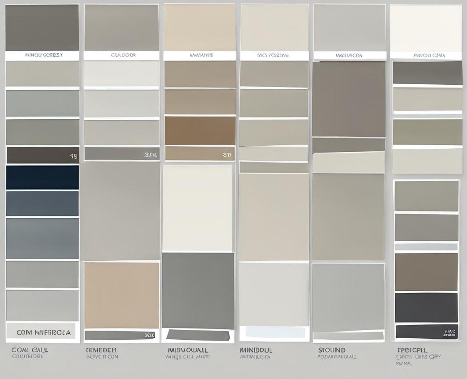
If you love the look of Mindful Grey but want to compare similar options, look at colors like Repose Gray and Revere Pewter. Repose Gray is another popular Benjamin Moore gray with more prominent greige undertones. Revere Pewter is a warmer taupe-gray from the same brand. Compare undertones and depth to find your perfect match.
How Does Mindful Grey Compare to Other Grays?
With so many gray paint options on the market, how does a color like Mindful Grey compare to other popular neutral grays? Here’s a quick look at how it stacks up against some of the top contenders:
Repose Gray
Mindful Grey and Repose Gray have similar light-medium depth. But Repose Gray has a stronger greige undertone coming through. Repose Gray reads as slightly more beige-influenced.
Edgecomb Gray
Edgecomb Gray is noticeably darker and moodier than the subtler, more versatile Mindful Grey. Edgecomb Grey has more prominent green-blue undertones.
Agreeable Gray
Agreeable Gray is much lighter and brighter than Mindful Grey. It has faint purple undertones rather than green/beige. Agreeable Gray is better for modern, airy spaces.
Chelsea Gray
Chelsea Gray is on the darker, stormier end of the gray palette. It has prominent undertones leaning blue/green. Chelsea Gray creates a very different look from neutral Mindful Grey.
Finding Your Perfect Gray Paint Color
When searching for the ideal neutral gray paint, keep the following tips in mind:
- Decide on the depth you want – lighter or deeper gray
- Sample 2-3 shades on walls to see undertones
- View gray samples in your space during different times of day
- Choose warm, cool, or balanced undertones
- Consider colors and finishes you want to coordinate with
The many shades of gray paint each create a distinct look and feel thanks to their unique undertones and depth. For a subtly complex gray that works in a wide range of spaces, Mindful Grey is an excellent option to consider. Properly sampling it in your lighting and rooms allows you to decide if it’s the perfect gray for your next paint project.
With its versatile, neutral undertones and light-medium depth, Mindful Grey has become a popular paint color choice for many homeowners. But the subtle complexity caused by its bluish-green and greige undertones means it’s especially important to properly sample Mindful Grey before committing to it. Make sure to view large samples on your walls in different lighting at various times of day to see how it truly interacts with your space.
Mindful Grey can adapt well to warm or cool color schemes, making it highly versatile. Just keep in mind it may look more flat and dull in north-facing rooms. When used thoughtfully by taking its unique traits into account, Mindful Grey creates a sophisticated yet soothing look in bedrooms, living spaces, kitchens, bathrooms, and beyond.
