White walls offer a gorgeous blank canvas for decorating any space. But choosing the right curtain color to complement all that bright white can be tricky. You want a shade that warms up the room without clashing or overwhelming the crisp, clean backdrop. The key is picking a neutral curtain color that blends beautifully. Neutral shades effortlessly match while adding subtle definition and depth to your windows. They create the perfect pairing for white walls in any room.
From beiges and taupes to light grays, these versatile neutrals complement white backdrops. They provide the ideal balance of contrast without overpowering. Read on for an in-depth look at each neutral color and get tips for incorporating them into your all-white space!
Beige Curtains Complement White Walls
Beige is a warm, welcoming neutral that pairs perfectly with white walls. The soft hue adds a subtle touch of contrast while matching seamlessly. Beige curtains in light and dark tones can work with any style from traditional to modern. Theyeffortlessly blend with white trim, furniture, and decor for a cohesive look.
In whitespaces, beige curtains warm up the backdrop and keep things light and airy. The flexibility of beige curtains allows you to easily switch up textures and patterns to complement your aesthetic. Try light linen-textured curtains for a breezy coastal cottage vibe. Opt for chunky woven beige curtains in a den or bedroom for extra coziness. The options are endless.
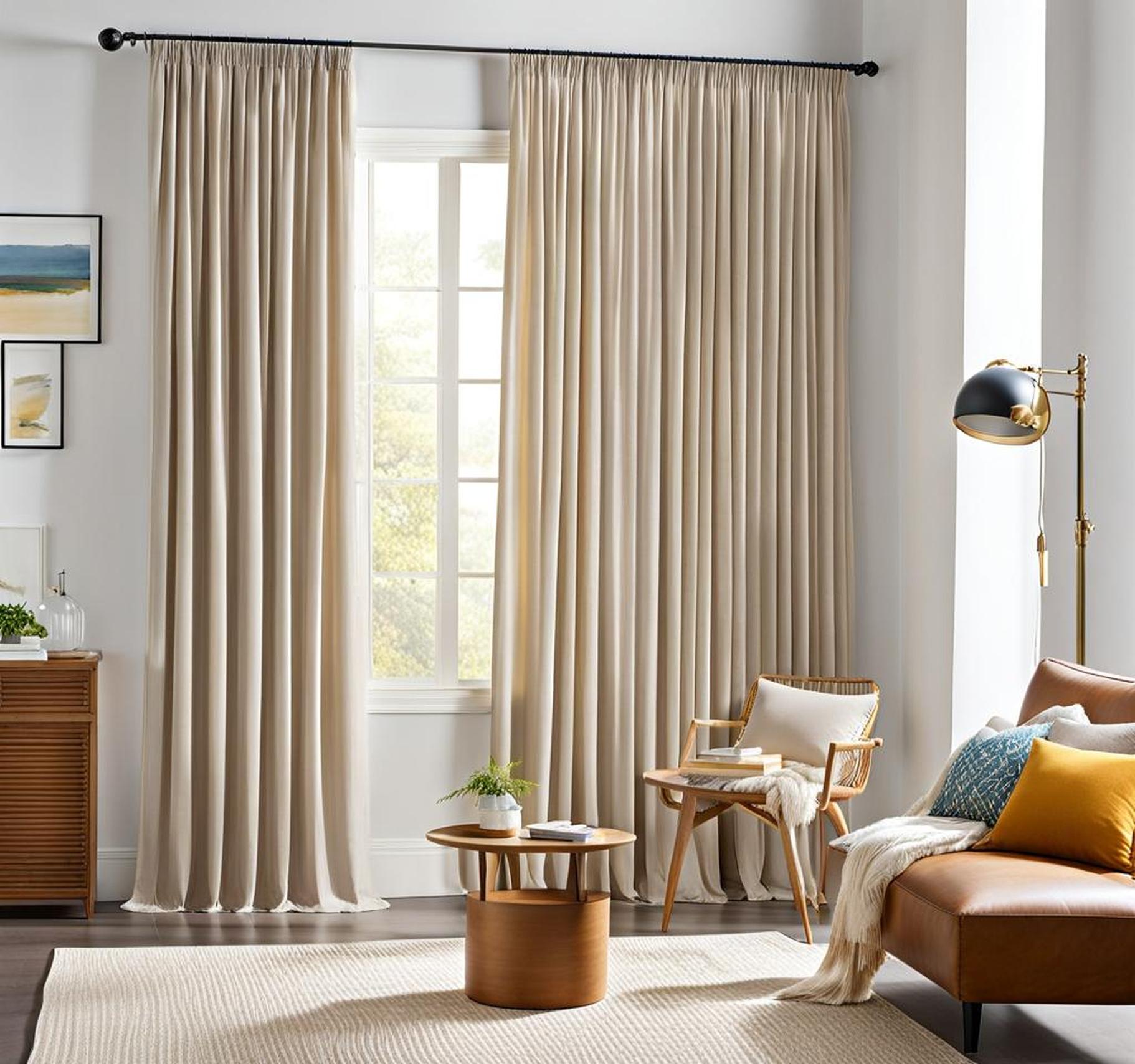
Use Light Beige Curtains for a Soft Look
Pale cream, oatmeal, or biscuit-hued curtains are beauty paired with white walls. The subtle contrast creates a soft, elegant feel. Light beige makes small spaces appear more open and airy. For beachy style, try a textured seagrass weave. Crisp linen-textured curtains in pale beige foster a romantic cottage vibe. In bedrooms, they instill a soothing ambiance that encourages restful sleep.
For modern flair, hang light beige floor-length curtains. The simplicity spotlights sleek furniture and decor. Alternately, pinch pleated curtains offer a touch of dimension. Accent with glossy black hardware for contemporary style. As a versatile neutral, light beige complements any existing colors and patterns in a room beautifully.
Opt for Darker Beiges to Ground the Space
For more contrast, go for deeper beige curtains that anchor white walls stylishly. Think warm sand, chocolate truffle or caramel shades that add a pleasing neutral backdrop. Darker beiges ground and define windows for a tailored look. They give white walls a touch of warmth without overwhelming.
In bedrooms, rich beige curtains lined in blackout material ensure darkness for uninterrupted sleep. Pair them with chunky textures like chenille or wool for ultimate coziness. Deep beiges also help delineate spaces and corners in open floor plans. Go for thick floor-length curtains and watch them transform white walls into a stylish focal point.
Taupe Curtains Add Neutral Contrast
Defined as a mixture of brown, gray, and black, taupe offers the perfect subtle neutral contrast against bright white walls. It sits on the spectrum between beige and gray with a slightly darker, more modern edge. Think warm stone, weathered wood, or mushroom – the muted nuances distinguish taupe from beige.
Taupe’s versatility allows it to fit any style. It adds definition to walls and windows without overwhelming or falling flat. Textured taupe curtains complement glossy metallic accents and black wood tones beautifully. Sophisticated taupe makes a gorgeous counterpart to white; it’s ideal for elevated, contemporary spaces.
Light Taupe Curtains Keep Things Simple
For a clean and airy look, pale taupe curtains are the perfect choice. Soothing stone or latte hues provide subtle definition against bright white. The paleness maintains a light, ethereal vibe with minimal interruption. Crisp broadcloth taupe curtains foster modern freshness. For texture, stonewashed linen in biscotti taupe looks and feels amazing.
The simplicity of light taupe allows other colorful furniture, rugs, and art to shine. It creates a soothing oasis of calm in bedrooms, living rooms, and offices. For lots of natural light, opt for lightweight linen or cotton. To darken a room, choose lush velvet in a pale taupe like moth grey. Design options are unlimited.
Dark Taupe Curtains for Dramatic Contrast
On the other end of the taupe spectrum, deep shades make a dramatic statement against white walls. Charcoal, truffle, or thundercloud taupe curtains anchor the windows while providing neutral contrast. The darkness amplifies and warmly defines white backdrops for a luxe look.
Pair textured chenille or velvet taupe curtains with glossy black accents and dark wood tones. For traditional spaces, taupe damask or brocade add ornate elegance. Or create cozy cabin ambiance with heavy wool in a deep, earthy taupe. Long lengths and generous gathering saturate walls in moody warmth. Dark taupe makes it easy to achieve designer style.
Warm Up White Walls with Light Gray
Crisp white walls beg to be softened with light gray. It provides subtle contrast while maintaining an airy, neutral palette. From platinum and silver to heather and fog, light grays offer nuance without overwhelming. They add depth and dimension to white backdrops gracefully.
Light gray beautifully enhances rooms anchored in white. It allows metallic furniture and glossy black accents to pop while introducing contrasting texture. Light gray also pairs gorgeously with white trim for a tailored, sophisticated look. There’s a match for any style from industrial to rustic.
Solid Light Gray Curtains
For a straightforward neutral choice, solid light gray curtains always hit the mark. Palest dove grays blend harmoniously with white walls and provide a clean, modern feel. Medium heathered grays offer more contrast while remaining soft and flexible. Crisp broadcloth gray adds texture and elegance to white spaces.
Hang light gray curtains wide and long to keep things minimalist. Choose sleek satin curtains to spotlight colorful artwork or patterned area rugs. Opt for breezy linen or cotton for an airy, beach house vibe. The simplicity provides a stunning canvas for decor and furniture.
Textured Light Gray Curtains
While solid grays complement white walls gorgeously, textured fabrics take it to the next level. Introducing varied weaves and patterns amplifies visual interest in whitespaces. Fromboucle and herringbone to striped and embroidered, textured gray options abound.
In living rooms, chunky gray chenille or tweed curtains add cozy sophistication. Brushed cotton in pale fog gray provides laid-back contrast. Bold variegated stripes in ash and dove grays make a lively graphic statement. Use curtain panels and tiebacks for lots of luxurious gathering.
For bedrooms, embroidered gray linen curtains foster tranquility and texture. Opt for blackout-lined options to ensure darkness. The possibilities with textured light grays on white backdrops are truly endless.
White walls offer a gorgeous, open backdrop and choosing the perfect complementing curtain color can feel daunting. But neutral shades effortlessly match the brightness while adding subtle contrast and visual interest. Beiges, taupes, and light grays blend beautifully without overwhelming.
Versatile neutrals like beige provide laid-back warmth and elegance. Sophisticated taupes add polish and modern edge. Light grays softly contrast while allowing other colors and textures in the space to shine.
Each neutral shade offers unique benefits. But they all match white backdrops seamlessly. Consider the ambiance you want for the space, along with personal preferences. There are endless neutral varieties and textures to explore for the ideal pairing.
With the right neutral curtain choice, anyone can warm up their white walls stylishly. So move beyond standard whites and make a subtle yet stunning statement with your windows!
High Contrast: Bold Curtains Against White Walls
If you prefer a dramatic, bold look, don’t be afraid to use high-contrast curtains against your bright white walls. Pairing opposites on the color wheel, like blue and orange or purple and yellow, makes for an eye-catching combo. Or go for classic black and white – try bold black and white buffalo check or striking stripes. The contrast creates a vibrant focal point.
Color Blocking: Graphic Curtain Patterns
Color blocking your curtains is another way to make a striking statement against white walls. Try arranging solid blocks of color, like rust, navy, and peach, for bold definition. Or incorporate graphic patterns like checks, stripes, or geometric shapes using contrasting colors. The color blocks create rhythm and interest against the blank white canvas.
Patterned Prints: Mixed Brights and Whites
Don’t overlook fun patterns and prints! Floral curtains, ikat patterns, or graphic palm prints in mixes of bright and neutral colors will complement white walls beautifully. The key is choosing patterns with plenty of crisp white incorporated to tie everything together. The mix of brights and whites prevents the patterns from overwhelming the space.
Saturated Hues: Pops of Color
Another idea is choosing rich, saturated curtain colors to contrast brightly with white walls. Vibrant hues like emerald green, sapphire blue, and berry pink make the windows a bold focal point. For bonus drama, go for velvet or satin in saturated hues and watch them glow against the white backdrop. Don’t be shy with bold color!
Layered Textures: Dimensional Interest
Don’t forget the impact of texture when complementing white walls. Layering different textured fabrics adds appealing dimension and visual interest. Try pairing a breezy white linen curtain with a nubby colored wool panel. Or hang a lightweight white sheer against substantial colored velvet panels. Mixing textures brings satisfying depth.
Color Temperature: Warm vs. Cool Tones
Color temperature also affects the vibe created by curtain colors against white walls. Warm earth tones like terracotta, mustard, and brick red will make a space feel cozier and more inviting. Cool tones like sea blue, sage green, and violet infuse a calmer, more serene ambiance. Choose tones aligned with your goals for the room.
Natural Light: Sheer vs. Opaque
The amount of natural light you want filtered through the curtains will help guide fabric choices. Sheer linen or cotton curtains maintain brightness in a space while colored sheers add a hint of tint. Opaque velvet, chenille, or damask block light for intimacy. Layer sheers over colored opaque panels to customize light filtration.
Layering: Build Dimension
As mentioned, layering different curtain panels creates appealing dimension against white walls. Hang a breezy white sheer against colored opaque panels for customization. Or pair sleek satin panels with chunky textured panels. The layering possibilities are endless for added depth.
Keep the room’s functionality in mind when selecting curtain colors too. Blackout lining helps darken bedrooms and media rooms. Lightweight sheers maintain openness and brightness well in kitchens and offices. Room-specific needs will help hone your curtain color selection.
