Repose Gray is a neutral paint color that is popular for kitchen cabinets. But how does this versatile gray actually look in a kitchen? What colors complement it best? We’re answering every question you have about incorporating Repose Gray cabinets into your own kitchen design.
Below we’ll cover everything from the undertones that give Repose Gray its signature look to dreamy kitchen inspiration showcasing this gorgeous color.
What is Repose Gray?
Repose Gray is a popular paint color by Sherwin Williams included in their Neutral Color Collection. It’s a warm, inviting gray that pairs beautifully with a variety of materials and finishes.
While many grays can look rather cold and stark–almost having a blueish tint–Repose Gray sets itself apart with subtle undertones of purple and brown. These undertones give it a softer look than your average gray, making it an easy color to incorporate into kitchen designs.
In addition to its specialty gray undertone, Repose Gray can be described as:
- A versatile neutral that suits contemporary to traditional home styles
- A light-medium color with an LRV (Light Reflectance Value) of 58%
- A color that allows other kitchen elements to shine rather than overpowering them
Why Choose Repose Gray for Kitchen Cabinets
Timeless & Versatile Neutral
One of the key benefits of selecting Repose Gray for your kitchen is its versatility. This inviting gray looks gorgeous paired with nearly any color scheme or kitchen style.
While bright white kitchens have dominated in recent years, many homeowners are shifting towards soft neutrals like Repose Gray for a more relaxed look. The gray acts as a subtler backdrop that fits seamlessly into both contemporary and traditional spaces.
Repose Gray cabinetry also complements a wide variety of materials and finishes beautifully. It looks striking against elements like marble backsplash tile, quartz countertops, butcher block islands, and brass or black metal hardware.
Durability & Easy Maintenance
Another advantage that makes Repose Gray cabinets so popular is their longevity and durability. The finely honed paint formula helps cabinets hold up well over time–resisting fading, yellowing, and scratches through years of heavy use.
Repose Gray’s lighter paint formulation also allows the rich color to shine through properly, even after countless scrubs and cleanings. This makes keeping your gray kitchen cabinets looking like new much easier compared to deeper shades.
Design Ideas for Repose Gray Kitchen Cabinets
Countertops & Backsplashes That Complement
Identifying finishes that work cohesively with your Repose Gray cabinets is key for pulling off a stylish, holistic kitchen design. Here are some of our favorite countertop and backsplash pairings:
- Butcher block countertops: The rich, natural pattern of wood grain pairs strikingly with cool-toned grays.
- White or light quartz: Crisp light counters help anchor Repose Gray, while quartz resists stains and scratches.
- Carrara marble backsplash: Classic white marble tile provides eye-catching contrast and dimension.
- Large format tiles: 12×24″ glossy ceramic, porcelain, or stone tiles complement the modern simplicity of gray.
Hardware & Fixtures That Enhance
Elements like hardware, lighting fixtures, and shelving are the jewelry of your kitchen. Consider mixing Repose Gray with attention-grabbing metals and materials like:
- Black iron fixtures, shelves, and hardware for a contemporary edge.
- Aged bronze or oil-rubbed bronze finishes give a timeworn, vintage look.
- Brass and champagne gold accents lend a subtle brightness.
- Glass cabinet fronts or open shelving lighten up the look.
Lighting Considerations
Test Paint Swatches
The way a color like Repose Gray appears is tremendously impacted by lighting conditions. When viewed in natural light, Repose Gray takes on a warmer, more welcoming personality.
On the other hand, under dim artificial lights or cooler LED bulbs common over sinks, the gray can skew slightly cooler and more blue/purple in tone.
When selecting a shade like Repose Gray, be sure to view large painted swatches in both natural sunlight and the types of lighting built into your kitchen. This gives you the best sense of how the color truly presents.
Adjust Existing Lighting
If your kitchen contains older lighting you aren’t quite ready to replace, simple adjustments can drastically change how Repose Gray looks:
- Swap out any dated fluorescent or blue-ish bulbs for warmer 2700-3000K LEDs.
- Install undercabinet lighting to reduce shadows.
- Add pendant lights over islands and seating areas cast a more natural light.
Incorporate Additional Lighting Layers
The more varied lighting sources present in your kitchen, the more dimension Repose Gray cabinets will take on.
Consider incorporating lighting at multiple levels, like:
- Hanging pendants for style and task lighting
- Undercabinet LED strips to illuminate counters
- Decorative sconces framing sinks or the range
- Toekick lighting inside lower cabinets for ambient glow
The Best Paint Finish for Kitchen Cabinets
Sheen Levels
While color obviously plays a major role, sheen makes a big impact on a kitchen as well. The perfect sheen helps Repose Gray cabinets withstand daily wear while retaining maximum richness.
For most cabinetry, popular sheen options include:
- Eggshell: Subtle shine, velvety appearance. Resists fingerprints and cleans easily.
- Satin: A touch more luster than eggshell. Shows some reflection without being overly “shiny” like semi-gloss.
Matte finishes trend for their velvety appearance but show every mark. High-gloss reads very formal and shows imperfections. Eggshell or satin offer that perfect middle ground.
Application Tips
Achieving an immaculate, smooth finish comes down to diligent prep and application. Be sure to:
- Lightly sand cabinet boxes, doors, and drawers
- Use painter’s tape for clean edges
- Remove doors, drawers, and hardware where possible
- Prime evenly using a high-bond primer
- Allow proper dry time between paint coats
- Seal with a protective clear coat for added resilience
Repose Gray Inspiration — Kitchen Photo Gallery
Seeing Repose Gray featured in real home kitchens can provide tremendous inspiration for your own design. Here are some stunning rooms showcasing Repose Gray cabinets paired with different materials and styles:
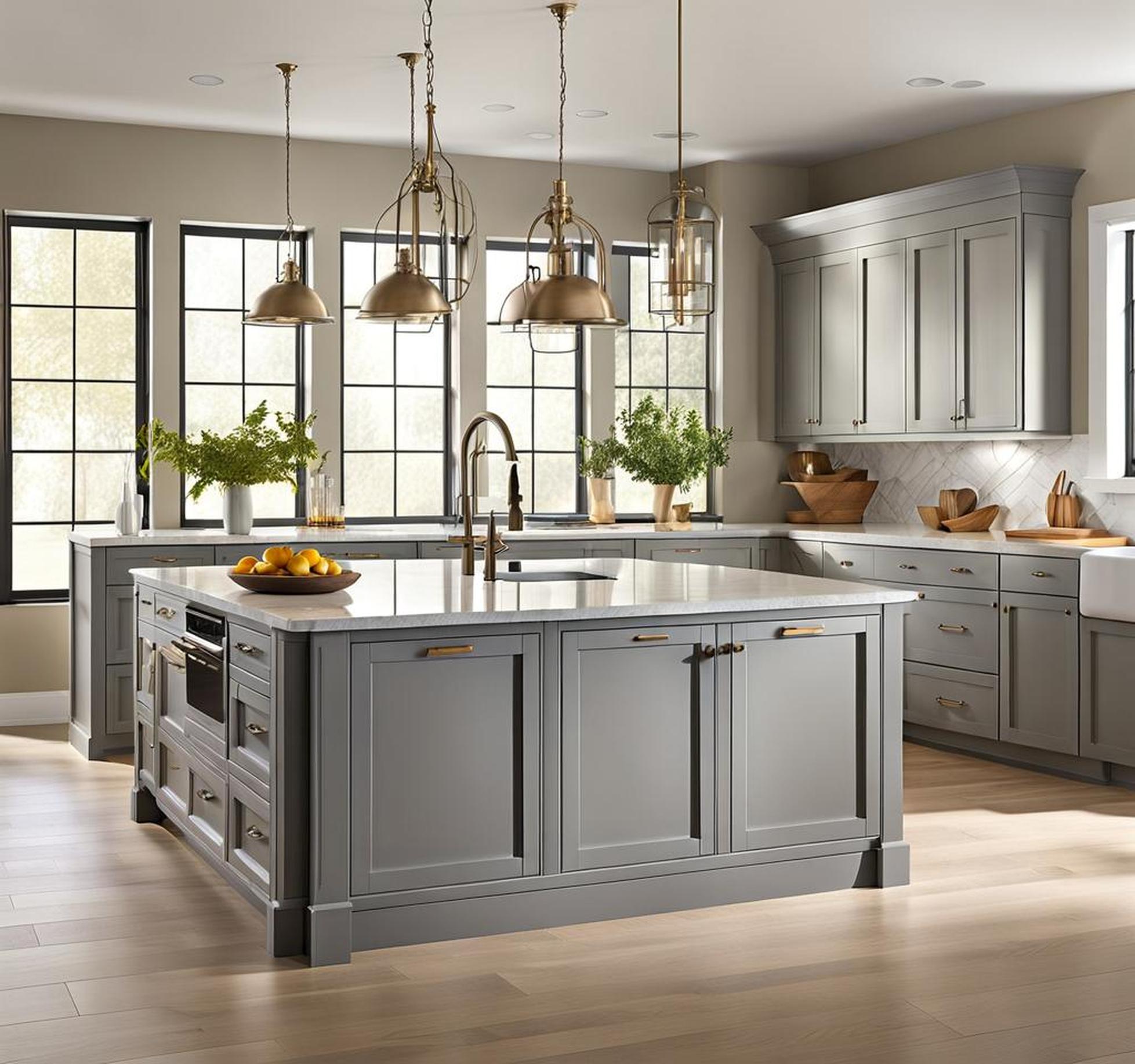
Transitional Kitchen With White Counters
This kitchen strikes an elegant transitional look blending traditional shaker cabinet fronts with integrated modern conveniences. Crisp white counters temper Repose Gray uppers, while sleek brass bar pulls contribute eye-catching shine.
| Cabinet Style | Shaker |
| Countertops | White quartz |
| Backsplash | Carrara marble herringbone |
| Hardware | Aged brass bar pulls |
Modern Kitchen With Wood Accents
This contemporary kitchen allows Repose Gray to take center stage. Crisp cabinet fronts with invisible handles play nicely against rich wood accents in the open shelving, butcher block counters, and tri-colored backsplash.
| Cabinet Style | Handle-less |
| Countertops | Butcher block |
| Backsplash | Natural stone mosaic |
| Shelving | Black iron pipes & reclaimed wood |
Traditional Kitchen With Gold Accents
Finally, this traditional kitchen pairs Repose Gray uppers with lower white Shaker cabinets for lovely contrast. Glassy cabinet fronts allow gold knobs and lighting to shine as focal points.
| Cabinet Style | Shaker/Glass Front Upper Cabinets |
| Countertops | Marble/White Quartz |
| Backsplash | White Subway Tile |
| Hardware | Gold Cup Pulls |
FAQs About Repose Gray Kitchen Cabinets
Does Repose Gray look good with oak?
Yes, the warm yet muted tones of Repose Gray complement oak beautifully without competing. Together they create a soothing, inviting kitchen palette.
What trim goes well with Repose Gray cabinets?
We recommend white or extra crisp trim to make Repose Gray cabinets really stand out. Softer antique white and cream tones can also complement them elegantly.
With ample lighting, Repose Gray can work wonderfully in small kitchens to open up the space visually. Incorporate glass cabinet fronts, mirrors, metallics, and lighter wall colors.
Repose Gray is a charming gray paint color that brings warmth and style to all different kitchen designs. We hope this complete guide gives you the inspiration to incorporate it into your own space!
