If you’re looking to give your home an instant facelift, switching to a two-tone exterior color scheme is one of the most dramatic yet budget-friendly approaches. Combining two colors on your home’s exterior provides layers of visual interest and makes architectural details pop. But executing a stylish two-tone design requires careful planning and placement. Follow the strategies in this guide to craft a striking exterior that doubles your home’s curb appeal.
A two-tone exterior refers to using two different colors or materials on the facade of a house. This could involve two different paint colors, a mix of siding materials like traditional lap and decorative shingles, or a combination of the two. The effect can be subtle or bold depending on your color choices and placement. But no matter the approach, a two-tone exterior instantly creates dimension and vibrancy.
Choosing a Color Scheme for Maximum Impact
With so many potential color combinations, selecting the right scheme can be overwhelming initially. Follow these guidelines when choosing colors for optimal contrast and flair.
Factors to Consider in Color Selection
When deciding on two tones for your home’s exterior, consider the following:
- Undertones: Choose colors with similar undertones, either warm or cool, to avoid a clashing look. For example, pair a warm terra cotta with a warm sage green.
- Level of contrast: Do you want a subtle or dramatic contrast? Darker and lighter shades of the same color provide subtle contrast, while complementary colors amp up the drama.
- Color theory and harmony: Refer to basic color theory to select colors that complement each other and create a harmonious composition. Analagous, complementary, and triadic schemes are great starting points.
- Historical style of home: If your home has a distinct architectural style, select a color scheme that honors that aesthetic. Research colors used in that era.
Popular Color Combination Approaches
Some tried-and-true two-tone color schemes give you creative inspiration:
- Different shades of one color: For a monochromatic look, use lighter and darker versions of any color. Gray and charcoal siding with white trim is a popular example.
- Colors next to each other on the wheel: Analagous colors like blue and green or yellow and orange coordinate seamlessly. This provides contrast without starkness.
- Complementary colors: Bold red and green or purple and yellow provide maximum contrast since they are opposite on the wheel.
- Analogous colors: Adjacent colors on the wheel, like blue and purple, offer a nuanced and sophisticated color story.
Using a Neutral Third Color for Trim
Most two-tone schemes look cohesive and polished with the addition of a neutral trim color like white, black or gray. The trim shade connects the two main tones and often plays an important role in enhancing or downplaying the overall contrast. For example, bright white trim makes colors pop whereas a dark trim minimizes contrast between the main tones.
When evaluating two-tone exterior designs, pay particular attention to the trim color. Make sure it complements the other tones as well as the architecture. The best approach is to test out trim color options on a small swatch before finalizing your palette.
Strategic Placement for a Cohesive Look
While choosing two harmonious colors is a good first step, the real impact happens in the execution. Carefully placing each tone to complement architectural features and the overall form is essential. Apply these tips when planning your exterior layout:
Most Common Two-Tone Layouts
- Dominant color with secondary accents: One color takes the lead across siding, with the second used strategically on windows, doors, trim, or other elements.
- Upper and lower halves differ: The first floor and second floor (if present) sport different colors for a layered, dynamic look.
- Recessed areas like windows and doors highlighted: Entryways, garage doors, window trim, and other recessed spots provide prime placement for a pop of color.
Tips for Color Placement
- Align colors with architecture: Place colors to underscore original architectural form. For example, use a contrasting color on vertically oriented bays or gables.
- Emphasize unique features: Draw the eye to special details like decorative millwork, art glass windows, or hand-laid brickwork with a contrasting color.
- Ensure consistency across elements: Use colors in the same way across windows, trim, entryways. Consistency creates harmony.
Execution Mistakes to Avoid
While planning your layout, steer clear of these common two-tone mistakes:
- Too many competing colors: Stick to two main colors plus a neutral trim for a simple, elegant scheme.
- Random color patches: Thoughtfully place colors in continuous sections, not disjointed patches.
- Mismatched architectural details: Use colors in a way that harmonizes with original architectural elements rather than fights against them.
Two-Tone Style Ideas for Different Homes
The two-tone possibilities are endless, but certain palettes and placements lend themselves particularly well to popular architectural styles.
Contemporary and Modern Homes
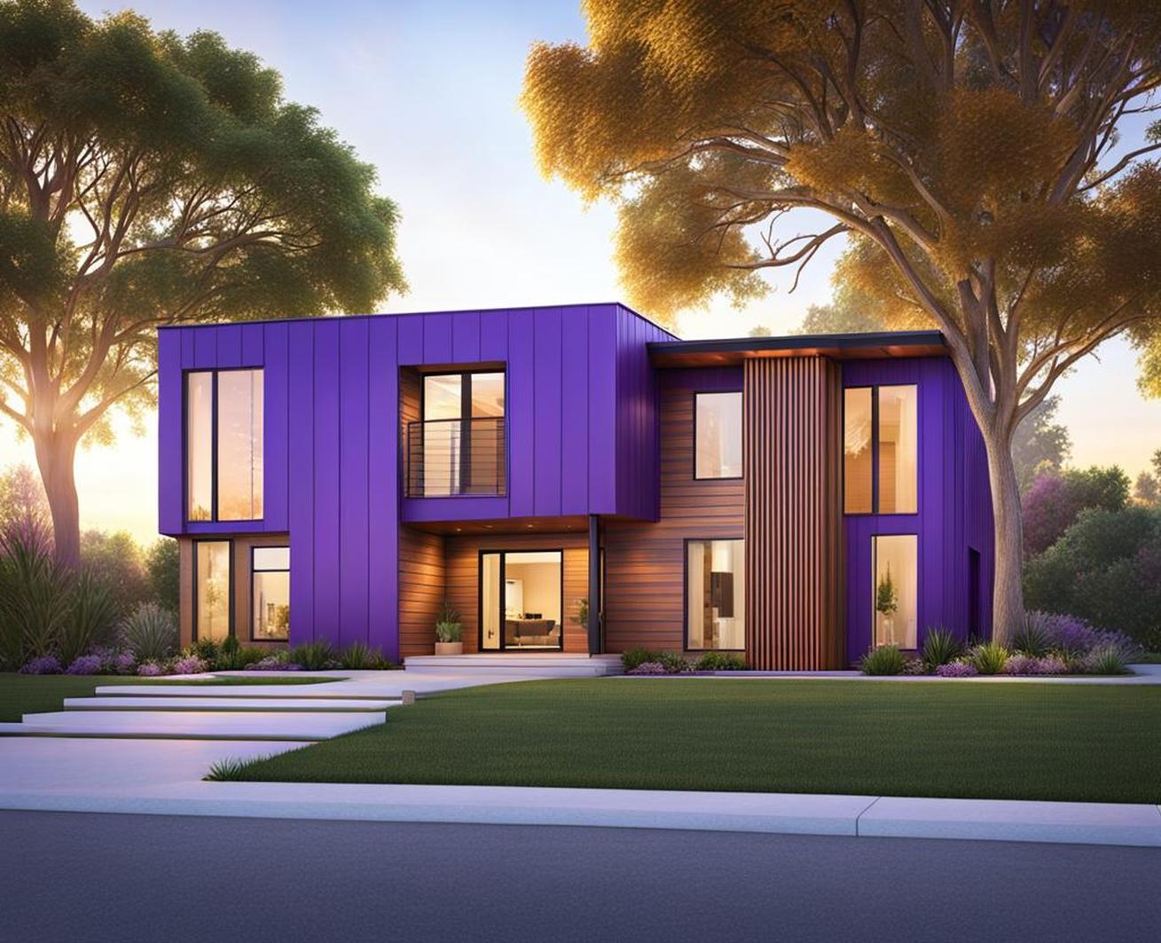
On contemporary homes with clean lines, muted stucco, and geometric accents, make a bold statement by:
- Choosing daring, nontraditional color combinations like cobalt and orange or sage and maroon.
- Highlighting unique angular features like an A-frame roofline with color.
- Placing colors in graphic, geometric blocks rather than freeform sections.
Colonial and Traditional Homes
For classic colonial or traditional designs, take a more subtle approach:
- Select a soft, luminous color palette with heritage inspiration.
- Use the second tone only on architectural details like shutters or entryways rather than whole sections.
- Choose a white or black trim to sharply define the calmer tones.
Ranch Style Homes
On a rambling ranch, highlight the horizontal shape by:
- Placing contrasting vertical siding or trim strips at regular intervals.
- Using one tone on the body and a different color on the front door only.
- Defining the varied roofline with color.
Implementing a stylish two-tone exterior color scheme requires forethought and planning, but the impact is monumental. Your home instantly gains depth, dimension, and curb appeal. Use the color selection and placement strategies outlined here as inspiration. Then create a combination and layout unique to your architecture. With the right approach, you can double the visual interest of your home with two skillfully selected and applied tones.
Just remember fundamentals like choosing color with similar undertones, tying everything together with trim, and aligning with architectural form. Additionally, reflect on key psychological and historical color implications. With restraint and a calculative composition, you can craft an exterior palette as captivating as it is cohesive. So embrace your home’s potential and refresh its look with a trendy two-tone facade that makes your design vision a reality.
