White walls are a popular choice for good reason – they make spaces appear brighter and more spacious. But on their own, crisp white walls can also feel monotonous and uninviting. If all-white rooms leave you craving more depth and visual interest, the solution may lie in cream trim.
Strategically applied cream or off-white trim elements like baseboards, casings, and crown moldings can add delightful cozy texture to pristine white walls. The contrast draws the eye, creating dimension that flat white paint lacks on its own. Beyond just aesthetics, cream trim’s warming effect helps balance brilliant white walls that can sometimes skew cold or sterile. The result is a lighter, airier ambience balanced by a welcoming enveloped feel.
The Problem With All-White Rooms
Lack Visual Interest and Depth
While white paint colors open up small dark spaces, wall-to-wall white can fall flat. When every surface in a room is the same crisp shade with identical finishes, it creates a monotonous uniformity. Without variation, all-white color schemes appear one dimensional and stark.
Absent color, texture, or tonal contrast, all-white interiors also lack visual depth. Our eyes need reference points to perceive dimension. But smooth white surfaces blend together with little differentiation, causing spaces to look hollow and bare rather than bright and fresh.
Feel Cold and Uninviting
Light colors like white inherently impart airier vibes which makes them well-suited to small spaces. But take white too far and rooms can start to feel icy and impersonal rather than clean and open. White’s clinical aura comes from its long history of use in sparse institutional settings.
Unpainted white trim against white walls particularly falls flat. When baseboards, casings, and crown moldings fade into the background without differentiation, rooms lose dimensionality along with individuality. Details get washed out instead of providing the eye-catching punctuation needed to warm up all-white backdrops.
Gets Dirty Too Easily
Though valued for seeming clean and fresh, white paint has an Achilles heel – it visibly shows every scuff mark, fingerprints, and dust accumulation. When white walls, ceilings, and trims flow seamlessly together without contrasting segments, each blemish stands out in stark relief.
High traffic areas like hallways and entry spaces reign supreme for revealing grime on white surfaces. Crisp white also demands frequent touch-ups to maintain its bright just-painted look compared to deeper hues.
The Power of Cream Trim
What is Trim?
Trim refers to decorative moldings that conceal seams and add accent details. This includes:
- Baseboards – border the bottom of walls
- Crown moldings – sit atop walls where they meet ceilings
- Door/window casings – frame openings
Though sometimes ignored, trim plays an important role enhancing architecture with dimensionality and visual weight.
Adds Dimension and Contrast
Cream trim against bright white walls elicits an eye-catching wow-effect largely absent from single color backdrops. As the deepest tone in the palette, the trim pops forward while walls recede. This makes small spaces appear more expansive by giving sightlines greater depth.
Sharpening the contrast between surfaces frames each architectural detail. Windows and doorways stand out instead of fading into the scenery. Ceilings feel pleasantly higher as crown moldings reclaim their stabilizing visual presence tying the space together.
Warms up the Space
White is unquestionably the cooler tone between it and cream. By nature, crisp white interiors skew sterile and icy. Introducing cream’s warmer golden peach undertones brings in underlying notes of cozy brightness that temper white’s sometimes harsh glare.
The cream trim’s warmer personality attractively mingles with adjoining white planes to strike an ideal balance between them. This gives the scheme more emotional range – simultaneously refreshing yet soft around the edges.
Easier to Keep Clean
Strategically placing cream trim means no longer having large expanses of unbroken white paint to maintain. Concentrating color and texture onto smaller trim surfaces makes cleaning less tedious while allowing pristine white walls to stay spotlighted.
Dust and dirt blends in better on cream shades without starkly announcing itself like on white backdrops. You’ll spend less time with a ladder and touch up brush fixing every minor scuff that dares appear.
Choosing the Right White and Cream Tones
The Best White Undertones
Choosing the right white involves paying attention to its undertone – the subtle hints of color that come through. Whites with warm yellow, beige, or peach notes feel cheerful and cozy. Cool whites with blue or green undertones radiate crisper, brighter moods.
Decide if you want white walls to cast clean icy vibes or give off a softer radiance. For small low light rooms, warm whites prevent an icy impersonal feeling. In southern or western exposures, cool whites won’t intensify warm daylight colors.
Finding a Creamy Contrast
The cream trim shade must provide enough tonal differentiation from white walls without venturing into beige or greige territories. Steer clear of creams with strong yellow, orange or brown undertones as they could visually “muddy” adjoining crisp white planes.
The darling combo is a white with subtle warmth paired with a cream featuring similar peachy undertones. This creates pleasurable, nuanced contrast without colors clashing. The white keeps everything buoyant while cream adds just enough richness.
Testing Paint Swatches
View paint swatches on sample boards in natural daylight when making final shade selections. Solid color chips are helpful for preliminary sorting but can’t replicate results on actual walls. Light changes paint colors’ appearances drastically from dark feature walls to bright accent trims.
Paint overlapping swaths of different whites and coordinate creams directly on room walls. Move boards to different spots then live with choices over the course of a day or two as lighting and moods shift.
Styling Tips for White and Cream
Furniture
White and cream painted furniture keeps the focus on crisp architectural details versus heavy pieces competing for attention. Light natural wood finishes in oak or ash warm up the space without darkening the scheme.
Upholstered headboards, dressers, and nightstands suit bright bedframes. White slipcovered sofas and chairs provide flexibility to swap out seasonally for bursts of color while floor lamps and console tables anchor rooms without heaviness.
Textiles
Layer lighter toned natural fiber rugs like jute, sisal, or seagrass rather than blocking views of white floors. Sheer whispery curtains filter light beautifully without saturating bright rooms. Linens mix white and cream through duvets, shams, and decorative throws for coziness.
Keep accents like pillows and vases creamily neutral then weave in subtle organic hues like sand, wheatgrass green, and sky blue for added interest without competing with white and cream stars of the show.
Additional Pops of Color
Paintings, floral arrangements, ceramics, and glassware infusion sparingly concentrated spurts of richer tones prevent all-neutral schemes from falling flat. Deep emeralds, berry reds, cobalt blues enliven without overpowering. Contrast also heightens perceived brightness – important for north facing rooms.
Metallics resemble captured sunlight bringing shimmering warmth. Brushed brass, graphite nickel, and matte steel infuse elegant sheen as contemporary or traditional sculptural lighting, decorative legs, hardware and mirrors.
White and Cream By Room
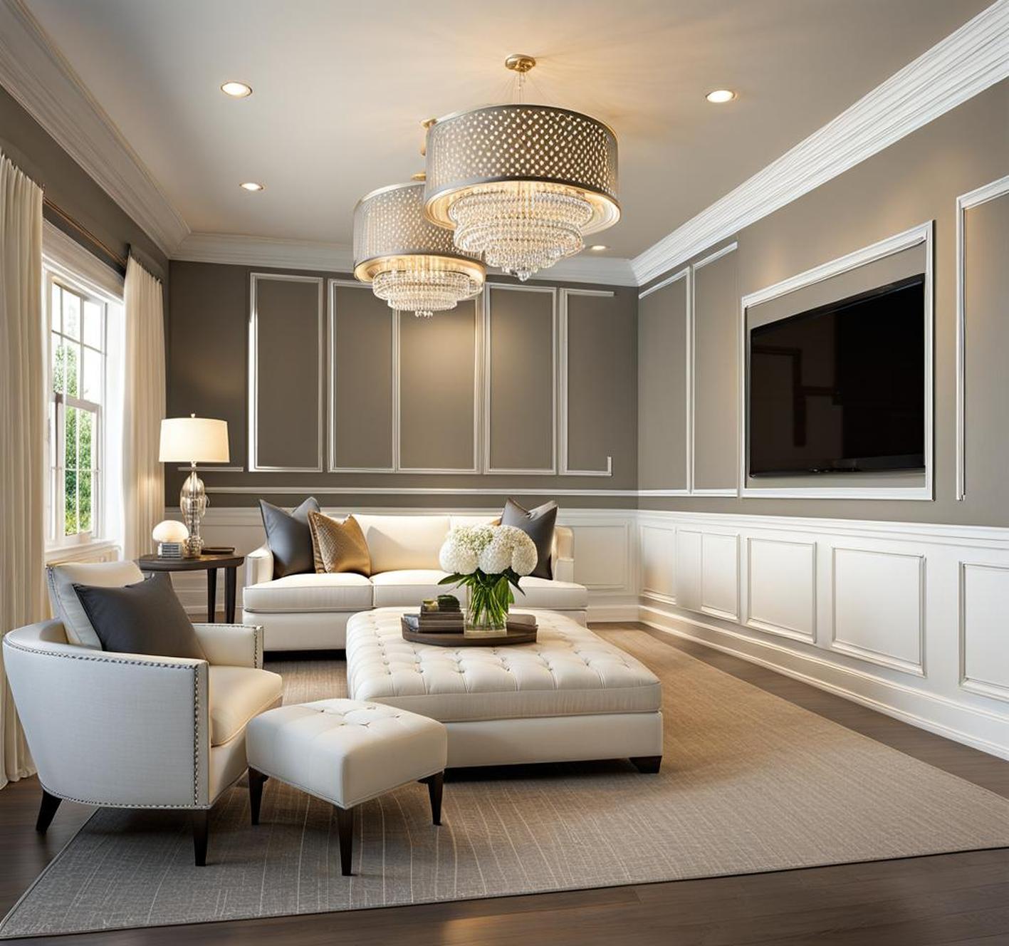
Living Room
Cream window trim inside an all-white living room frames treetop views creating an idyllic indoor-outdoor feel. Floating shelves bathed in natural light display collections as artwork anchoring the room. Darker cream fireplace trim and mantle pop against bright walls drawing focus to crackling fires on chilly days.
Bedroom
A painted white brick or shiplap fireplace wall covered with stockings and garlands provides cottagey contrast to polished white beadboard ceilings. Cream nightstands feel brighter and less visually heavy than darker woods that would dominate the small space. Mirrored furniture reflects light opening up corners.
Kitchen
The workhorse kitchen sees lots of mess but white ceramic backsplashes clean up easily with warm cream cabinets, open shelving, and an oversized island providing streamlined storage contrast. Buttery recessed lighting casts everything in a cozy glow aided by pendant lamps over prep zones keeping countertop tasks brightly illuminated.
FAQs About White Walls and Cream Trim
Does white and cream feel too neutral?
The key to keeping an all-neutral palette interesting lies within nuanced color and texture contrast. Paint collection whites and creams span a wide spectrum from crisp cool to nurturing earthy. Interplay those against each other alongside matte upholstery, nubby linens and woven lampshades.
Vary sheens too – flat walls, glossy ceramic vases, metallic candle holders. Neutrals become deeper and multifaceted instead of flat and monotonous even without rainbow brights.
What about white walls and white trim?
White on white risks appearing washed out and bland if tones perfectly match. But if thoughtfully coordinated, varied whites elicit appealing uniformity. The trick is playing warmer antique whites against brilliant snowy shades without competing tones clashing.
Conversely, matching cool or warm whites together builds restful, uncomplicated clean backdrops. Different glosses like gloss trim against flat walls contrast without diverging tones.
Absolutely! Neutrals serve as versatile foundational springboards for infusing vibrant color in small to large doses. Accent walls covered in emerald green, sapphire blue or marigold yellow paint or wallpaper enliven while furniture and accessories remain creamily neutral.
Colorful art, throw pillows, area rugs and floral arrangements concentrate cheerful hues. Progress from all cream and white to gradually bolder color infusions for easily updatable made-to-measure splashes.
