When potential homebuyers cruise through a neighborhood, the first thing that catches their eye is the exterior of each house. The colors and textures of your home’s facade make that all-important first impression and influence buyers even before they step inside.
Two exterior elements that can drastically impact your home’s curb appeal are the front door and shutters. Thoughtfully pairing door and shutter colors creates a welcoming entrance and brings cohesion to your home’s overall look.
Matching Door and Shutter Colors
One traditional technique for choosing door and shutter colors is selecting the same hue for both elements. Matching colors on your door and shutters unifies the look and helps the entryway appear tidy and pulled-together.
For a timeless, elegant style, classic color pairings like white, black, navy, or gray doors and shutters can’t be beat. Crisp white or off-white on both the door and shutters emanates old-world charm. A black door coordinating with black shutters is similarly sophisticated. For a polished nautical vibe, navy blue on the door and window shutters ties the look together seamlessly.
Don’t think that matching door and shutter colors has to be boring neutrals only. Rich shades like red, purple, green, or yellow on both the door and shutters make a lively statement. Just be sure to pick colors that complement the rest of your home’s exterior.
Tips for Picking Matching Colors
When selecting matching door and shutter colors, keep these tips in mind:
- Consider your home’s architectural style. Traditional homes often look best with classic matched colors like white, black, gray, navy, red, or yellow.
- Pick colors appropriate for your region’s climate. Hot climates do better with lighter shades that won’t fade, while cool climates can get away with deeper hues.
- Look at surrounding homes to choose colors that fit within the neighborhood’s palette.
- Match colors to existing exterior features like the roof, trim, brick, and siding colors.
- Opt for muted, timeless shades for resale value vs trendy colors.
Benefits of Matching Door and Shutter Colors
Some perks of painting your front door and shutters the same color include:
- Creates a unified, harmonious look
- Can be very traditional and classic
- Especially suitable for historic homes
- Keeps the eye moving rather than stopping on one element
- Easier to match replacement doors/shutters later
Contrasting Door and Shutter Colors
While matching door and shutter colors offers one appealing aesthetic, choosing two different colors can really make your entryway pop. The contrast between the door and shutters frames the entrance and highlights each architectural detail.
Standard rules of color theory apply here–complementary colors tend to creating striking contrast. A bold blue door against brick-red shutters makes both elements stand out while contrasting beautifully. Accent the calm of gray shutters with a vibrant orange or yellow front door.
Don’t be afraid to get creative and daring with your color combinations. Forest green shutters provide the perfect complement to a cheery sunflower yellow door. Play up the drama with eggplant purple shutters against a true white door. The options for jaw-dropping contrast are endless!
Tips for Complementary Colors
Keep these color tips in mind when selecting contrasting door and shutter hues:
- Use a color wheel to identify complementary color pairs
- Pick a vivid door color first, then choose a shutter color that contrasts
- Consider adding a third color on other exterior details to tie the combo together
- Aim for high visual contrast between shades (light vs dark, muted vs bright)
- Pair warm and cool colors for vibrant contrast like yellow and blue
- Make sure colors have the same undertone to avoid clashing
Benefits of Contrasting Colors
Reasons to consider contrasting door and shutter colors include:
- Draws attention to the entryway
- Adds visual interest to the facade
- Allows you to be creative and bold
- Ideal for modern or contemporary home styles
- Gives dimension and depth to the front exterior
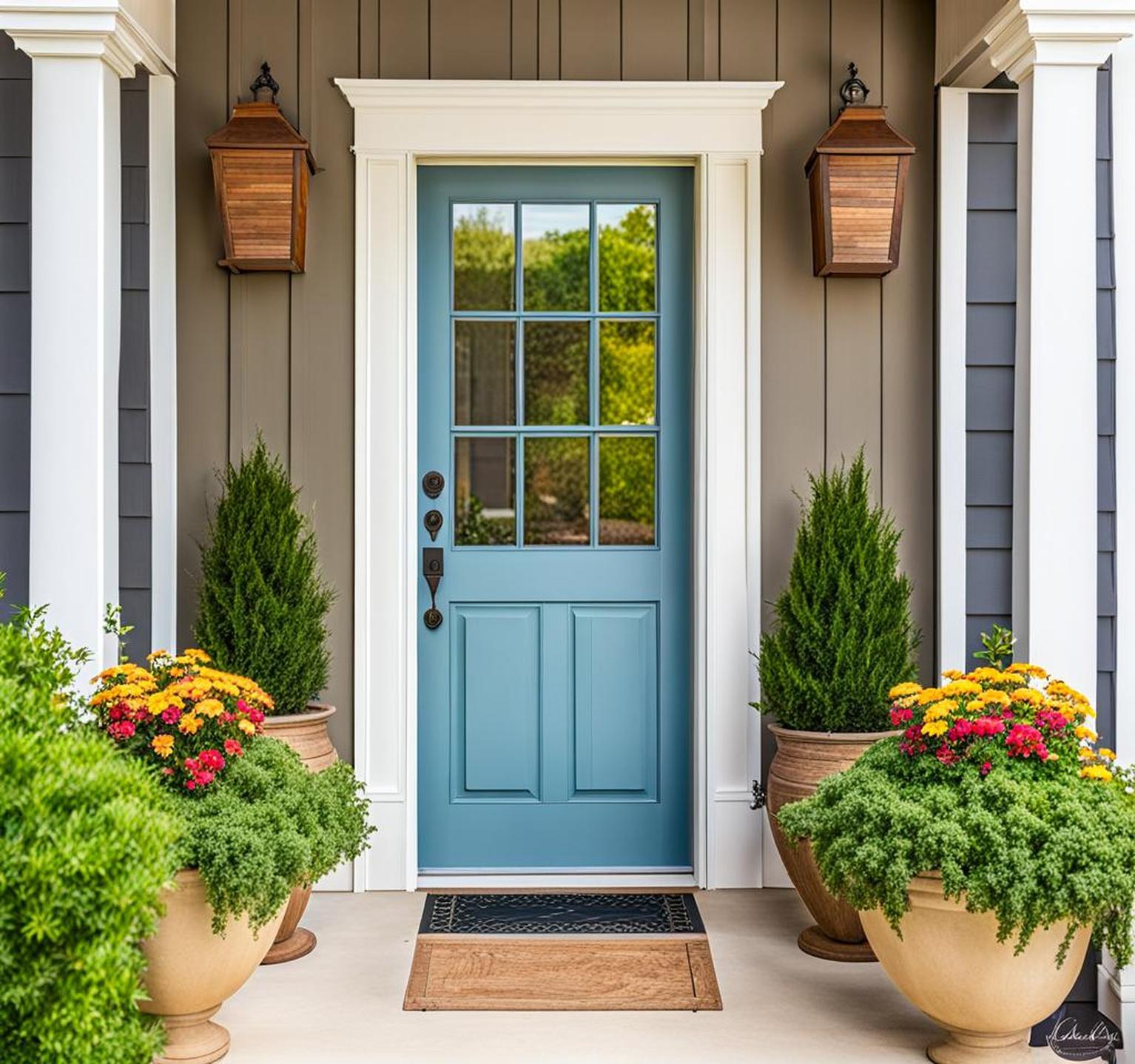
Neutral Base and Colored Door
Another option is to create contrast while keeping the bulk of your exterior neutral. The trick is to paint the shutters, siding, and exterior walls a subdued neutral color. Beige, white, light gray, and other quiet hues make an ideal neutral backdrop.
Then, make the front door the star of the show. Select a vibrant, saturated shade for the door that contrasts strongly with the neutral base. Cobalt blue, fire engine red, and lime green doors against neutral shutters and walls pack a visual punch.
This color scheme works especially well for accenting front entrances framed by columns or other interesting architectural details. The neutral exterior allows the colorful front door to pop as the focal point without competing colors.
Choosing Neutral Shades
When creating a neutral exterior base, consider these neutral shades:
- Off-white or beige for a subtle, warm neutral
- White or crisp greige for a light but cool backdrop
- Light gray for an elegant and versatile neutral
- Sand or buff for a natural, earthy neutral
- Charcoal gray for a sophisticated darker neutral
Selecting an Accent Door Color
Vibrant accent colors for your front door include:
- Navy or cobalt blue for nautical flair
- Coral, yellow, or teal for a cheerful pop of color
- Forest green for an earthy yet bold contrast
- Red or orange for eye-catching brightness
- Eggplant or purple for a regal effect
Current Trendy Color Combinations
While classic white and black never truly goes out of style, some fresh, trendy door and shutter color combinations are emerging. Here are some current, on-trend pairings:
- Sage green shutters with a peach or coral pink door – This pairing mixes retro with modern for a current vibe.
- White shutters and a charcoal gray door – Crisp white against the richness of charcoal gray creates an elegant, upscale look.
- Bright yellow door with navy blue or black shutters – The happy brightness of a yellow door pops against dark dramatic shutters.
- Purple door and light gray shutters – Regal purple makes a statement against quiet gray shutters.
- Red door and white shutters – This traditional yet timeless combo will always endure.
You can also look to each year’s Pantone Color of the Year for inspiration on trendy shades to embrace.
Tips for Choosing Colors
Beyond basic color theory, keep these tips in mind when selecting shutter and door shades:
- Factor in your home’s architectural style – traditional homes lean towards classic combos vs contemporary homes that suit bold colors.
- Pick colors that complement existing exterior materials like roof shingles, stonework, and exterior siding colors.
- Opt for colors that will stand out against your home’s exterior surfaces. Dark brick benefits from light colors while light stucco can handle deeper hues.
- Aim for colors you’ll love seeing on your home every day, even if trendy colors fall out of fashion later.
- Test swatches under both natural and artificial light to see all undertones.
- Use multiple coats for the richest color payoff and durability.
- Choose exterior-grade paints that stand up to weathering.
Making Your Front Door Pop
A surefire way to highlight your home’s entrance is to make the front door a focal point. Use these techniques to draw the eye straight to your door:
- Paint the door in a bold, saturated shade that contrasts strongly with the shutters and exterior.
- Choose a door with an interesting shape, like an arched door, that visually stands apart from the rectangular shutters and windows.
- Incorporate sidelights, a transom window, or other decorative glass around the door to accentuate it.
- Add stylish yet substantial door hardware like oversized knobs or knockers.
- Illuminate the door with exterior lighting fixtures like lanterns or spotlights.
- Use planter boxes, a trellis, or benches to frame the door area.
- Select a door with a wood grain or textured surface for visual interest.
Avoiding Common Mistakes
While the possibilities for door and shutter color combinations are endless, beware of these common mistakes:
- Picking too many colors for the exterior, which looks chaotic and disjointed.
- Choosing colors that clash with your home’s existing materials like brick or stone.
- Selecting trendy colors that may look dated after a few years.
- Using colors that fade quickly in the sun and elements.
- Combining colors that distract from architectural details.
- Painting flat, lackluster colors like builder-grade beige as the default.
Carefully planning your exterior color scheme avoids these pitfalls. Analyze how potential colors complement your home’s style, exterior surfaces, and surroundings.
Your home’s front door area essentially represents its personality and character to the outside world. Thoughtfully pairing shutter and door colors creates visual interest while presenting a coordinated, welcoming exterior.
Whether you opt for classic white, bold contrasts, or neutrals with a colorful door, your color choices should ultimately reflect your home’s architecture and style. Look to surrounding homes for cues but don’t be afraid to make your entryway uniquely you.
You can set the tone for amazing curb appeal with strategic use of color.
