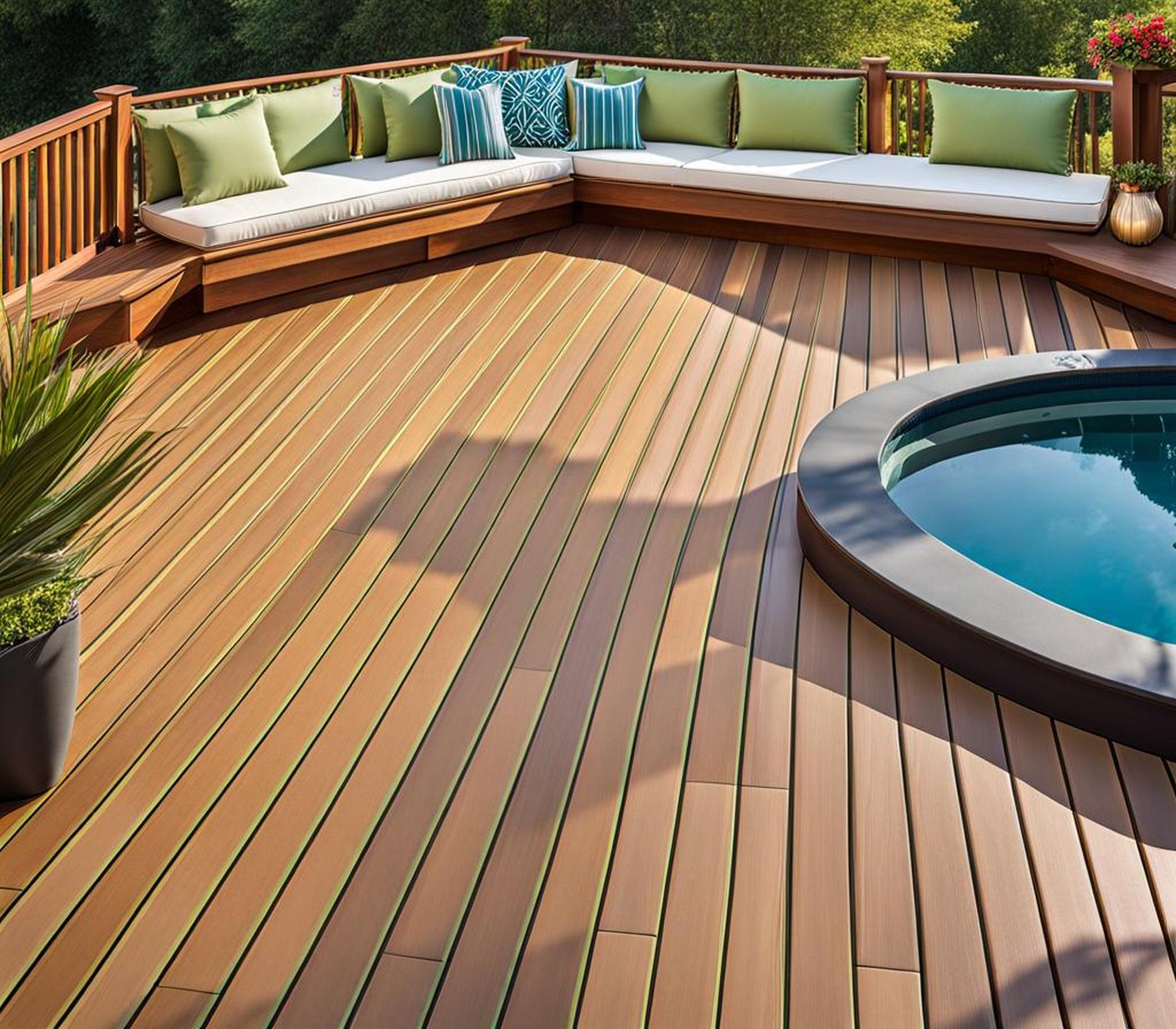
Does your outdoor space need a major style upgrade? Are you bored with your deck’s predictable solid color? Two-tone decking is here to bring excitement back to your backyard oasis! Playing with contrasting colors and textures can create a showstopping space perfect for entertaining and impressing guests.
Combining two complementary tones is an ingenious way to add visual drama to a deck. The burst of color energizes the space and makes an unforgettable first impression. With the right color combo, you can transform a basic deck into a vibrant highlight of your home’s exterior. Let’s dive into how to artfully execute this eye-catching trend!
Choose Complementary Colors for Striking Contrast
Complementary colors are directly opposite each other on the color wheel, creating maximum contrast when paired. They naturally grab attention while also balancing each other out. Using these bold complements is one of the most dynamic ways to fashion your two-tone deck.
Color Wheel Basics
On the color wheel, complementary colors sit 180 degrees apart. Some classic examples are red and green, blue and orange, and yellow and purple. These combos create color vibration, making your eyes pop back and forth between the two shades.
Pay attention to a color’s undertone as well so they work together. A cool blue pairs better with a warm orange versus a cooler shade. Understanding color theory helps you nail the right complementary duo.
Vibrant Color Combos
For your deck, eye-catching complements like navy blue and pumpkin orange or lime green and cherry red are sure to impress. Bright purple railings against sunny yellow deck boards make a radiant statement.
Burgundy and seafoam green offer an unexpected combo full of personality and flair. Try matching pale sky blue decking with chocolate brown benches or vibrant accents.
Don’t be afraid to think outside the box with unorthodox color matches that excite you. The contrast itself creates drama!
Tips for Pulling off Complements
When working with complementary colors, use them strategically so they enhance each other instead of clashing:
- Use one color as the dominant decking tone and the other sparingly for accents.
- Ensure proper undertones so hues blend instead of fight each other.
- Try out combos on online deck visualizers first.
With thoughtful planning, you can highlight your deck’s daring side with complementary contrasts that wow.
Achieve Cohesion with Analogous Schemes
For two-tone decking with subtle harmony, using analogous colors is the way to go. Analogous colors sit directly next to each other on the color wheel, creating a cohesive, soothing look.
Color Harmony 101
Analogous colors share common tones and hue families, lending them inherent unity. Often they are grouped into warm analogous or cool analogous schemes, with all shades sharing similar undertones.
Examples include soft greens, teals, and aquas or earthy beiges, browns, and brick reds. Their close relationship results in more coordination than contrast.
Soothing Analogs for Decks
Consider moody navy blue deck boards with weathered gray benches and cool toned slate pavers underfoot. Or go for warm terra cotta decking bordered with caramel rails and tan footpads.
A nature-inspired earthy palette could feature mixtures of olive, sage, moss, and celery green tones. For a coastal vibe, blend shades of ocean blue, sky blue, and seafoam green.
Whatever analogous family fits your style, the overall effect will be subtle and serene.
Executing Analogous Schemes
Follow these guidelines when working with analogous colors:
- Use varying widths of each tone for interest.
- Let one hue dominate decking while the other accents steps and rails.
- Repeat a color in outdoor accessories to tie the scheme together.
Carefully blending colors from the same family results in a polishing finishing touch for any deck.
Contrast Within Color Families for Subtle Interest
You don’t have to choose colors from opposite sides of the color wheel to make a statement with two tones. Subtle contrast within a single color family can also create visual appeal.
Playing with Light and Dark
A monochromatic scheme featuring different shades, tints, and tones of a single hue naturally provides gentle contrast. Light brown deck boards paired with dark brown railings and benches is a classic, elegant combo.
For a gray scale deck, mix weathered wood rails with cool, steely gray decking. Contrasting intensities of the same color provides subtle flair.
Warm and Cool Tones
Playing with warm and cool versions of similar colors is another way to inject faint contrast. For example, use warm cedar decking with cool concrete pavers underfoot. Or make railings and furniture a cool taupe gray against rich espresso deck boards.
Matching intensity levels are important so one tone doesn’t overpower. But allowing undertones to complement each other builds intrigue.
Tips for Familiar Colors
When pairing light and dark shades or warm and cool tones, remember these pointers:
- Use contrasting accents sparingly for balance.
- Allow undertones to complement each other.
- Review photos of common pairings to visualize combinations.
Familiar colors with a twist make for cohesive, inviting deck designs.
Unleash Creativity with Multicolor Decking
Variegated and multi-tone decking opens up a world of possibilities for one-of-a-kind two-tone schemes. Embrace a collage of captivating colors to make a showstopping statement.
Variegated and Mixed-Hue Boards
New composite and wood decking lines feature multiple tones and graining built right in. Many have streaking, swirling mixtures of brown, red, gray, and tan for inherent vibrancy.
These variegated boards instantly expand two-tone deck options by providing several harmonious undertones in one plank.
Making Mismatched Colors Work
With multi-hued decking, you can get creative combining contrasting colors that normally seem disparate. The variety of undertones allows unconventional combinations to work together.
Just ensure all the tones complement one another in some way. Repeating colors frequently creates balance and rhythm.
Design Inspiration
Check out these stunning samples of multicolor decks:
- Red, brown, tan, and cream variegated planks with blue pavers inset
- Purple, green, and turquoise boards forming a mosaic geometric design
- Orange, yellow, and lime green diagonal accent stripes across neutral decking
Let your imagination run wild! Thoughtful placement allows clashing colors to become captivating.
Two-tone decking opens up a world of eye-catching possibilities for your outdoor space. Complementary colors lend high-impact drama and flair. Analogous schemes promote subtle harmony. Playing with intensities and undertones within color families adds finessed contrast.
Variegated planks unleash the chance to combine adventurous hues with artistry. Whatever color combo captivates you, strategic two-tone decking is the perfect way to refresh your backyard.
Ready to revamp your deck? Reach out to local decking experts who can help bring your dramatic vision to life!
1. Contrasting Borders: Instead of using contrasting colors for the entire deck, consider creating a border around the perimeter of the deck using a different color. This can help define the space and create a visually appealing contrast against the main color of the deck.
2. Mixed Materials: Consider mixing different materials for a two-toned effect. For example, you could use composite deck boards in one color and pavers in a contrasting color for the border or seating area.
3. Geometric Patterns: Create a two-toned geometric pattern using different colored deck boards. This can be achieved by using different shaped boards, such as squares, triangles, or hexagons, in contrasting colors.
4. Stepped Seating Area: Create a stepped seating area using different colored deck boards. This can help break up the space and create distinct areas for lounging, dining, and entertaining.
5. Diagonal Stripes: Use contrasting colored deck boards to create diagonal stripes across the deck. This can help create a dynamic and modern look, while also breaking up the expanse of the deck.
6. Mosaic Designs: Use a mosaic pattern with small sections of different colored deck boards to create a visual texture and intricate detail. Get creative with the shapes and layout!
