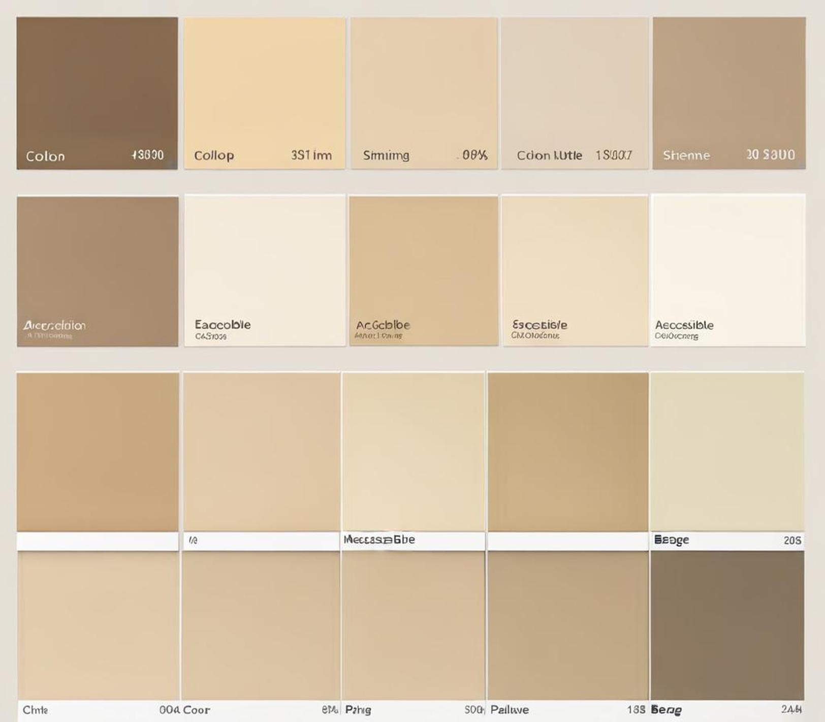
Accessible Beige is a tremendously popular neutral paint color from Sherwin Williams. This versatile, welcoming hue leans just slightly towards beige in its undertone. With an LRV (light reflectance value) of 58, it is considered a midtone that adapts well to various spaces and lighting conditions. Accessible Beige creates warm, modern backdrops that feel timeless yet current.
The subtle brown and beige undertones provide enough depth without overwhelming. This allows Accessible Beige to serve as a blank canvas in terms of interior design; it gets along with all sorts of styles from traditional to contemporary. Its barely-there color means bolder accent pieces can take center stage. Simply put, Accessible Beige provides a soothing, livable neutral that designer and homeowners alike rely on when updating spaces.
Complementary Color Theory
In interior design, undertones influence which colors pair cohesively together. Warm, earthy shades feel harmonious alongside other warm hues. Meanwhile, cool blues and grays lean towards fellow cool tones. Since Accessible Beige features warm brown and beige in its base, we look to complements sharing those undertones.
However, undertones alone don’t determine combinations. The depth of color also factors in. A very saturated navy may overwhelm soft Accessible Beige, whereas a muted sky blue feels soothing. Furthermore, wildly varying lightness levels can disjoint a space. Generally, colors living nearby one another on the color wheel result in peaceful palettes.
Agreeable Gray
This tremendously sought-after gray appeals to designers and DIYers wanting an adaptable, greige-like neutral. While Gray Owl by Benjamin Moore claims the “world’s most popular gray paint color” title, many contend Agreeable Gray offers superior versatility surrounding colors and styles.
Green, blue, and purple influences give Agreeable Gray slightly cooler tendencies than Accessible Beige. Yet both are such gentle hues that they blend beautifully. Their comparable lightness means no shade overwhelms the other. Designers everywhere display this foolproof pairing; it remains a go-to combination.
Shoji White
Occasionally beiges require contrast to avoid dullness. That’s where bright, clean Shoji White comes in. This crisp white hosts the faintest warmth, pairing flawlessly with cozy Accessible Beige. Darker rooms desperately need this dazzling hue opening them up. Meanwhile, already well-lit spaces employ it to add modern elegance.
With barely a hint of ivory, Shoji White artfully tolerates the subtle earthiness of Accessible Beige. Together, the duo makes small rooms appear more expansive thanks to Shoji White’s airiness. This color scheme offers light and bright contemporary style perfect for modern, minimalist spaces.
Sea Salt
Placid as coastal California, Sea Salt proudly claims membership in the Accessible Beige family. Its barely perceptible sage hints lend the gentlest color interest when combined with warm beige. Despite incredible subtlety, this combination undoubtedly soothes. It epitomizes breezy West Coast style through its exceptional tranquility.
Accessible Beige feels familiar and comfortable alongside lushly understated Sea Salt green. As cousins on the color strip, they make for effortless cohesion. For groups struggling with color commitment issues, this scheme satisfies with its adaptability and mellowness.
Balanced Beige
Sometimes a space craves grounding through darker neutrals contrasting light ones. That’s where deep, earthy Balanced Beige enters: this shade lives just left of Accessible Beige on the actual color strip. So while marginally darker, natural harmony remains.
Together these flexible beiges offer a sanctuary-like warmth, reminiscent of welcoming living spaces. Balanced Beige handles south-facing rooms requiring richness. Meanwhile, famously adaptable Accessible Beige brightens up contained areas. This balanced scheme truly soothes mind, body and soul with its reliability.
Curate Your Custom Color Scheme
Given Accessible Beige’s celebrated versatility, opportunities abound for personalized palettes. Cooler grays like Grayscreen balance its warmth. Crisp whites prevent dullness; heathered options like White Heron add livability. Accent walls covered in deeper shades like Kendall Charcoal enrich the beige. Customize schemes around room attributes and decor.
Construction aspects influence paint decisions; consider architectural details and lighting. North-facing spaces might employ vivid accent hues popping against Accessible Beige. South walls require lighter balancing colors preventing heaviness. And view actual swatches in the room’s lighting before finalizing any selection.
Remember to step back assessing the combination’s overall cohesion. Varying sheens and finishes often help blend color families. Mix up flat, eggshell, and semi-gloss paints rather than relying on all satin finishes. Ensure all elements unite through the layering of appropriate accent pillows, rugs and curtains.
Pull It All Together
Hopefully the following tips equip readers to fashion gorgeous spaces illuminated by Accessible Beige’s warmth and flair. Lean into earth tones that welcome this adaptable neutral, letting it mingle beautifully. Then frame it with crisp whitespreventing dullness or richer beiges adding depth.
Complete the curated color scheme by styling your rooms appropriately. Forest green and navy blue accent pillows enliven creamy beige sofa against Balanced Beige walls. White bedding soothes Sea Salt green bedroom walls where vibrant art makes a statement. Espresso wood finishes ground bright whites against Shoji White and Accessible Beige backdrops. Thoughtfully tie everything together through your space’s functional decor.
We recommend showcasing Accessible Beige walls rather than hiding them behind bold art or shelving. This versatile paint color remains too pretty to disguise fully. Allow it to shine while anchoring it with complementary colors suiting your room’s needs. Ultimately paint should function as a livable backdrop, not a loud statement. Accessible Beige adapts, making it the perfect supporting neutral no matter your style.
Hopefully we’ve illuminated all the possibilities surrounding beloved Accessible Beige. This reliably flexible paint color beautifies backdrops across design styles and room purposes thanks to its gentle earthiness. Finding colors that allow AB’s warmth to shine simply takes considering undertones and sheens.
We recommend poring over the swatches in person, visualizing combinations in your lighting. Adaptable Accessible Beige follows your decorative direction; it loves participation. Through mindful coordination with tones sharing its warmth, your space will undoubtedly soothe all who enter it. Happy designing!
