Looking to give your home an exterior makeover that makes it the most stylish on the block? One of the easiest ways to elevate your home’s aesthetic is by revamping the siding and shutter colors. The right color combination can transform the entire look of your house and give it serious curb appeal.
We’ll discuss how the colors affect your home’s curb appeal, popular color pairings, and factors to keep in mind when selecting shades. Read on for pro tips to help you create a fashionable, eye-catching exterior combo that makes your house the talk of the neighborhood!
How Siding and Shutter Colors Affect Curb Appeal
When it comes to home exteriors, the siding and shutter colors have a huge impact on the curb appeal. Curb appeal refers to the attractive first impression your home makes on potential buyers or visitors seeing it from the street. A house with great curb appeal stands out for its aesthetically pleasing exterior features that invite you to take a closer look.
The siding and shutter colors are arguably one of the biggest influences on curb appeal. A harmonious, stylish color scheme helps the architectural details pop and gives your home visual interest. It’s often one of the first things people notice. On the other hand, mismatched or drab siding and shutter colors can make your exterior look dated and blend into the background.
By thoughtfully selecting exterior paint and siding colors, you can transform the look of your home. The right color combo makes the home alluring, giving it an irresistible wow factor. When selling a home, this added curb appeal can even increase the value! Read on as we explore how to create a fashionable exterior scheme.
Things to Consider When Choosing Colors
When embarking on an exterior makeover, keep the following factors in mind as you select coordinated siding and shutter colors:
Existing Exterior Elements
Take stock of your home’s current exterior elements like the roof shingles, brickwork, stone accents and trim. Evaluate the undertones in these existing features. Your new siding and shutter colors should complement the undertones to create a cohesive, pulled-together look. If your stonework has subtle hints of beige, for example, steer away from cool blues and grays.
Home Style and Era
Consider your home’s architectural style and era. Some hues naturally suit certain home styles better than others. For historic homes, stick with traditional color combinations versus bold statement shades. On sleek, modern designs, vibrant colors make more sense than neutral earth tones. Research typical exterior color palettes used on homes of the same style from the same era for inspiration.
Natural Lighting
Test out paint or siding color samples by holding them up outside your home at different times of day. Natural lighting conditions change the appearance of colors. Ensure the shades you select look great in morning sunlight, midday brightness and evening dusk lighting.
Pay attention to which direction your house faces as well. North-facing sides only get indirect light, causing colors to appear muted, while south-facing walls get intensified sunlight that washes hues out. East and west sides fall somewhere in between. Consider the light exposure when planning color placement.
Neighborhood Scheme
Scope out what colors are commonly used on other houses in your neighborhood. You want your color scheme to fit into the established aesthetic so your home complements the area instead of clashing. The surrounding homes provide inspiration on which tones work well in the environment.
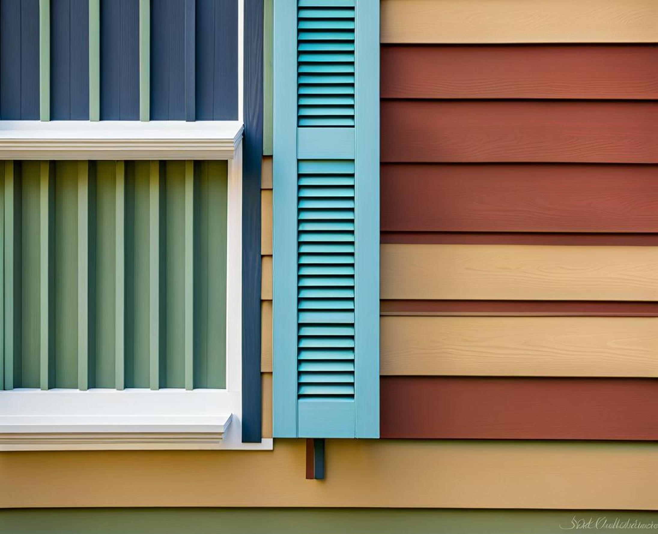
Popular Siding and Shutter Color Combinations
Looking for tried-and-true exterior color schemes? Here are some of the most popular pairings that add fabulous curb appeal:
Classic Black and White
The timeless combination of white siding with black shutters remains the gold standard for elegance and versatility. Crisp white siding serves as a neutral blank canvas, working beautifully with almost any roof, trim and accent colors. Contrasting black shutters make the windows and architectural details pop.
This classic combo suits homes of all different styles and eras for a fashionable yet timeless look. You can incorporate black and white confidently knowing the dramatic contrast will always turn heads.
Earth Tones
For a more natural yet still eye-catching allure, consider an exterior scheme featuring earth tones. Think light brown or beige siding paired with dark green, brick red or chocolate brown shutters. These shades complement one another seamlessly while adding character.
Earth tone combos feel welcoming on traditional suburban homes but can also add a refreshing pop of color to more contemporary designs. Try terracotta red shutters against light tan siding for a warm, rustic vibe.
Bold Hues
Feeling adventurous? Make your home exterior uniquely yours by pairing bold, vibrant siding and shutter colors. Contrasting bright hues like blue siding with orange shutters are guaranteed to catch attention and showcase your dynamic style.
Punchy color schemes work best on more modern home styles. They enable your house to stand out from subdued, neutral-toned homes in the neighborhood. Just take care not to overdo it–stick to one prominent accent color against a more neutral backdrop.
Create a Cohesive Color Scheme
When selecting a color palette, you’ll want your siding and shutter colors to coordinate, not clash. Keep these tips in mind for a harmonious exterior scheme:
Monochromatic
One sophisticated approach is to use different shades, tones and tints of the same color. For example, pair deeper reddish-brown shutters with light tan siding. Monochromatic color schemes are inherently cohesive since the colors are derived from the same base hue.
Vary the shades sufficiently so the siding and shutters don’t blend together. Soft yellow siding with muted dark yellow shutters, for instance, looks elegant and polished.
Analogous
Analogous colors sit next to each other on the color wheel, creating soft, harmonious combinations like light yellow and burnt orange. To make sure adjacent hues pair well, choose ones with a similar undertone–cool with cool, or warm with warm.
Going with analogous siding and shutter colors ensures your exterior color palette feels cohesive. The colors complement without clashing since they share common tones.
Complementary
For bolder contrast, you can select complementary colors opposite each other on the color wheel. Examples include blue and orange or purple and yellow. The contrast makes architectural elements pop while the color relationship prevents clashing.
Use this technique thoughtfully, however. Complementary colors can appear jarring if you select hues that are too intense. Muted shades like sage green and burgundy work better than primary colors.
Choosing new siding and shutter color combinations provides an easy and affordable way to instantly elevate your home’s curb appeal. The right colors can make your exterior eye-catching, welcoming and stylish.
As you pick your palette, consider the existing features of your home along with the surrounding environment. Look to other houses in your neighborhood for inspiration on which color schemes fit into the aesthetic. While neutral, earthy combos are easy, don’t be afraid to go bold if it suits your style.
Most importantly, have fun with it! There’s no need to settle for boring beige. Test out color samples and find the perfect shade combination to make your home exterior uniquely yours. With a little thoughtful planning, you can implement exterior paint and siding upgrades that highlight your home’s best features.
Before you know it, you’ll have the hottest curb appeal on the block! Drivers won’t be able to resist slowing down to admire your envy-inducing color scheme.
