Cream colored trim paired with crisp white walls can create a light and airy aesthetic that feels both traditional and modern. The soft cream trim against bright white walls provides definition and contrast, allowing beautiful architectural details to stand out. This elegant color scheme looks beautiful in most rooms but is especially popular in kitchens, bedrooms, and bathrooms.
However, successfully executing this cream and white look requires choosing the right white paint to complement the trim. You’ll also need to optimize the lighting and decorate with purpose. Follow these tips to make your cream trim pop against white walls.
Choosing the Right White Paint
Not all shades of white work well with cream. Choosing a white paint with the wrong undertone can make your trim look dingy, uneven, or mismatched. When selecting a white for cream trim, understand the basic paint undertones and test out samples before fully committing to the color.
Understanding Color Undertones
Every paint color, including different whites, has undertones that alter its appearance:
- Warm whites have yellow, peach, or cream undertones.
- Cool whites have blue, gray, or green undertones.
- Neutral white balances warm and cool undertones.
Since cream trim already has warm peach and yellow undertones, pairing it with a white that also skews warm can look muddy or matchy. For a clean contrast, a white with subtle cool undertones is ideal. However, stark bright whites can also overwhelm the cream, making it appear dingy. The best approach is a white with a very subtle cool undertone that still reads as a warm white. Here are some perfect options.
White Paint Recommendations
After extensive testing, these warm whites with barely detectable cool undertones look beautiful with cream trim:
- Benjamin Moore Simply White: A warm white with the faintest subtle gray undertone. Warm but not yellow.
- Benjamin Moore Swiss Coffee: Slightly creamier than Simply White with a beige tone. Provides a soft contrast.
- Behr White Metal: Crisp, not too stark, with barely there gray undertones.
- Sherwin Williams Alabaster: A popular decorator white with a hint of green.
Neutrally toned warm whites like these provide enough contrast against cream trim without appearing jarring or mismatching.
Testing Paint Samples
Never choose a white paint color based solely on how it looks on a little sample chip! The only way to know if your preferred whites pair well with existing cream trim is to test larger samples directly on your walls.
Paint 2×2 foot squares or larger patches on walls around the room and view at different times of day. The color can shift dramatically from morning light to evening. Paint samples also give you the chance to view furnishings and decor against potential new wall colors.
This hands-on testing takes more time up front but prevents you from being stuck with the wrong white for years to come.
Working With Natural Lighting
Another key factor in ensuring your cream trim pops against white walls is leveraging natural lighting. Assess the lighting in each space and make adjustments to spotlight your trim details.
Assess Lighting in Each Room
Take note of the following in every room before finalizing paint colors:
- Window placement and size. North facing? Bay windows? Small accent windows?
- How sunlight enters and moves throughout day. When is room washed in light?
- Is the space generally dark or bright? Cool or warm toned?
This helps you identify rooms where the intended whites and cream may look muddy or mismatching. For example, north facing rooms with small windows often read much warmer.
Arrange Furniture Strategically
Furniture placement impacts how paint colors appear. Avoid blocking prime sources of natural light. Angle seating areas near windows when possible to draw the eye. Position cribs and beds to spotlight cream trim details.
In darker rooms, keep walkways and seating near windows free of obstruction. Float furniture toward the center to avoid interrupting light.
Adjust Artificial Lighting
Supplement natural light gaps with strategic task and ambient lighting. Use dimmers to control brightness and paint colors. Install smart bulbs that let you adjust the color temperature.
Accent pendant lights over dining tables provide direct illumination. Sconces and picture lights highlight cream architectural trim and molding.
Selecting Trim Paint Technique
Another way to make cream trim stand out against white walls is choosing the right trim paint technique. From crisp bright white to subtle off-whites, tailor the trim to your aesthetic goals.
Contrast With Bright White Trim
For a contemporary, striking look, paint trim in a pure bright white like Benjamin Moore Chantilly Lace. This creates bold definition between the trim and lighter walls.
Just know that bright white also shows any imperfections. Meticulous prep and application is required to avoid uneven trim lines.
Complement With Off-White Trim
Some homeowners opt to paint trim an off-white shade that’s still lighter than walls. Popular options include Benjamin Moore White Dove or Sherwin-Williams Extra White.
The creamier off-whites are more forgiving on imperfect trim but provide subtler contrast from walls.
Add Visual Interest With Second Trim Color
For a unique twist, use a second color on select trim pieces like the front door or window frames. Black is popular for contemporary pops. Navy blue and olive green also complement white walls and cream details well as accents.
Just use a two-tone approach sparingly. Too many trim colors cause clutter and compete with your main palette.
Decorating With Cream and White
Finish off your cream and white room with decor that enhances the light, airy elegance. Keep everything light and subtle to let your trim and walls shine.
Furniture
Light wood furniture works beautifully against white walls and cream accents. Bleached oak, ash, and birch have neutral tones. Avoid any orange-hued wood stains.
Upholstered pieces should also stick to light neutrals like cream, linen, or pale gray. For occasional pops, bring in soft pastel blue seats.
Accessories
Add visual interest with black, gold, or antique brass accents. Textured ceramics, woven baskets, and marble surfaces also complement the cream and white palette.
Just don’t overwhelm the space with brightly colored artwork or decorative pieces. Let the walls and trim shine.
Textiles
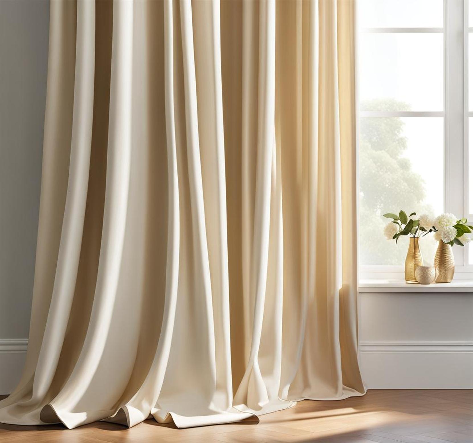
Continue the elegant neutral palette with textiles like pillows, throws, rugs and window treatments. Layer cream and white pillows for depth and dimension.
Sheer linen curtains in off-white filter natural light beautifully. Avoid bold patterns that compete visually with the trim and walls.
Achieving the popular cream trim and white walls aesthetic requires careful planning, from choosing the right white paint to decorating appropriately. But the results are stunning. The light and bright contrast lets your home’s architectural details shine while feeling both traditional and modern.
Follow these tips to allow your cream trim to pop against a crisp white backdrop. Test potential paint colors throughout the day. Work with your room’s natural lighting. Select trim paint technique and colors to get your desired contrast. And decorate with light neutrals that enhance this beautiful combo without competing.
Your cream trim will stand out against a white wall with the right paint and design choices.
