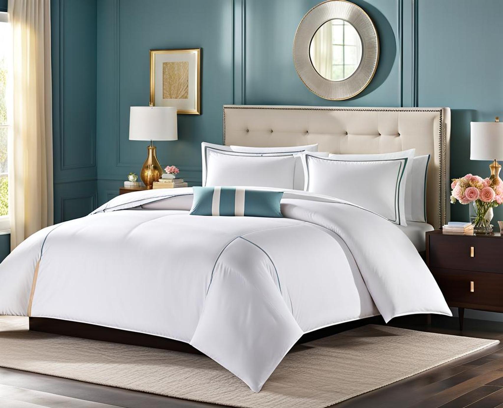
Looking to breathe new life into your crisp white comforter? Consider complementing it with a set of soothing pastel sheets. The gentle, airy hues of pastels create a light and relaxed atmosphere in the bedroom while adding just enough color to keep things interesting.
So why do pastels work so splendidly with an all-white comforter? Let’s explore some reasons behind this winning color combination.
Why Pastels Work With White Comforters
Pastels Create A Light, Airy Look
Pastel colors like mint green, lavender, and peach inherently have soft, muted tones. Unlike bolder primaries, they don’t pop brightly against an ivory or snow white down comforter.
This prevents any harsh contrasts in shade intensity. The pastels complement rather than compete with the crisp white foundation. The overall visual effect is much more peaceful and relaxing for the eyes.
The Psychology Of Soothing Colors
In color psychology, lighter tints and hues often evoke a gentle, serene reaction. We instinctively associate soft pastels with comfort, harmony and self-care.
Using pastel sheets channels this vibe into your sleep space brilliantly. Studies show lighter green tones reduce stress and promote deep sleep. Lavender and peach invoke nostalgia and tender memories to set the mind at ease.
Pastel Colors Found In Nature
The muted natural tones found in certain skies, flowers and seashells offer glimpses into pastel palettes. A perfectly painted sunset, the subtle gradient inside a pink rosebud or the pearlescent sheen on the inside of a seashell.
Adding pastel sheets can recreate these peaceful scenes, bringing the beauty of nature right into your bedroom decor. Feel transported by the softness of powder blue sheets resembling gentle skies or the cheerful glow of buttery yellow sheets evoking sunshine.
Best Pastel Sheet Colors For White Comforters
Wondering which exact pastel shades pair exquisitely with classic bright white bedding? Here are eight top contenders split into soothing neutrals and cheerful brights.
Soothing, Neutral Pastels
Light Gray
For those desiring a true neutral that complements any style, light gray sheets are a foolproof choice with a snowy down comforter. The muted, hazy tone keeps things ultra-soothing without a hint of contrast.
Lavender
With its barely-there purple tint, lavender evokes a zen, spa-like feeling. Coupled with white bedding, lavender sheets may actually help lower heart rate and blood pressure to promote deep, rejuvenating rest.
Powder Blue
As calming as a cloudless sky day, powder blue sheets have an inherent tranquility and weightlessness about them. Their softness plays beautifully against crisp white, creating visual interest without sharp contrast.
Mint Green
Mint green is beloved for its refreshing, rejuvenating quality. Paired with a bright white down comforter, mint sheets almost transport you to a secluded grove or hidden forest cove with their earthy green tones.
Cheerful Pastel Brights
Peach
For those desiring a punch of cheerful color, few can resist peach’s lively glow. Just bright enough to enliven without overwhelming, peach looks fresh and vibrant against a snowy white backdrop.
Lemon Yellow
Spread some sunshine over your bedding with vibrant lemon yellow sheets. This happy hue couples beautifully with white bedding, creating an atmosphere that’s uplifting yet still soft enough for serene sleep.
Baby Pink
Sweet, playful and utterly charming – those words define a baby pink palette. Its cute, girly glow plays nicely off white comforters in youthful, feminine bedrooms especially.
Pale Aqua
For those drawn to aqueous hues, pale aqua sheets are a splendid match for white comforters. Their soothing, watercolor-esque tint evokes imagery of smooth tidepools or clear shallow lagoons.
Pastel Color Palettes For A Relaxing Bedroom
Now that you have sheet color ideas, how about full palette concepts? Here are tips for putting together complete pastel color schemes with your crisp white comforter.
Monochromatic Pastel Schemes
One approach is choosing a single pastel hue then playing with different tints, tones and shades of it. Mix lighter and darker variants of green, purple or blue on sheets, walls and accents.
By keeping the colors all in the same family, you change intensity rather than hue. This creates tonal cohesion. The white comforter grounds the soft scheme.
Contrasting Pastels For Visual Interest
Alternatively, don’t be afraid to blend contrasting pastels together. Pair sheets and accents in analogous shades with related temperatures. Examples: peach sheets, mint walls and lavender curtains.
Or try complementary pairings between opposite sides of the color wheel. Powder blue sheets could couple attractively with peach pillows against white bedding for example. Such contrast adds flair.
Shop Top Pastel Sheet Styles
Ready to shop for your perfect pastel sheets? Here are quick recommendations of where to buy various sheet options online or in stores.
Breathable Cotton Pastel Sheets
For a cool, casual feel many love, Target offers quality solid and patterned pastel sheets in 100% cotton. Durable, breathable and easy to maintain, their Room Essentials lineup offers wallet-friendly prices. Popular picks include lilac medallion sheets or solid peach sheets
Luxurious Sateen Pastel Sheets
If you desire indulgent luxury against your skin, Brooklinen’s Lightweight Pastels Sateen collection may be perfect. Made of glossy long-staple cotton with a luminous sateen weave, they offer a dreamy hotel-style sleeping experience.
Vintage-Inspired Floral Pastel Sheets
For romantics enamored with florals and vintage allure, Anthropologie’s Primrose collection hits all the marks. Featuring painterly style botanical motifs in faded hues, their floral pastel sheets have a timeworn European charm.
Pastel Sheet And Comforter Pairing Ideas
Still uncertain which exact pastel sheets would complement your white down comforter perfectly? Here are four on-trend pairings to inspire you:
White Comforter With Mint Green Sheets
Crisp and refreshing like a mojito cocktail, this palette feels lively yet peaceful. Airy mint green sheets provide just enough color against snowy white bedding to feel energizing.
White Down Comforter With Lavender Sheets
Channel a relaxing spa getaway with calming lavender sheets coupled with plush white bedding. The pairing may actually help lower heart rate for deeper sleep.
White Duvet Cover With Peach Sheets
For a cheerful springtime vibe even in winter, try peach sheets with a bright white duvet. The blend of peach’s joyful glow against crisp white evokes images of cherry blossoms.
White Goose Down Comforter With Pale Pink Sheets
Pretty as a petal, pale pink sheets provide just a blush of color to delight against snowy white bedding. The pairing creates an innocent, feminine oasis.
In review, the subtle nature of pastel colors allows them to complement rather than compete with a bright white down comforter. Their peaceful qualities create a relaxing mood. And they effortlessly transport us to serene nature scenes.
When decorating your restful oasis, don’t limit pastels just to your sheets. Introduce matching or contrasting pastel tones through wall colors, area rugs and accent pillows too. Vary textures and patterns for depth and visual interest. Soon your space will reflect the soothing aura you desire.
Transforming your bedroom into a sanctuary has never been easier. With the simple addition of airy pastel sheets to your crisp white comforter, your space immediately takes on a lighter, airier feel. So breathe new life into your bedding and awake feeling refreshed every morning wrapped in your calming oasis. The hardest part is deciding which exquisite pastel hue speaks to you!
