When it comes to creating the perfect living room, choosing the right paint color is key. The hue you select for your walls can make all the difference in setting the overall mood and style of the space. From soft and calming tones to bold and energetic shades, paint has the power to transform the look and feel of any living area.
If you’re looking to give your living room a fresh new look this year, you’ll want to choose a fashionable and versatile paint color that aligns with your personal taste and lifestyle. To help make your decision easier, we’ve rounded up 12 of the best living room paint colors for 2022. From current trends to timeless classics, these hues are sure to breathe new life into your space.
Factors to Consider When Choosing Paint Colors
Before diving into the top paint options, there are a few important factors to keep in mind that will help guide your selection process.
- Lighting – The amount and direction of natural light your living room receives will impact how colors appear on the walls. North facing rooms with little natural light will look best with warmer shades, while south facing rooms awash in sun can handle cooler hues.
- Furniture & Decor – You’ll want to select a paint color that complements the existing furnishings and decor in your living room. Cool toned grays pair well with chrome and stainless steel, while earthy reds and browns match nicely with leather and dark wood tones.
- Room Use – How you plan to use your living room should also inform your paint choice. Cooler shades help create a relaxing atmosphere for lounging and reading, while warmer neutrals foster an inviting space for entertaining guests.
- Personal Taste – At the end of the day, you want a color that you find aesthetically pleasing and fits your style. Don’t be afraid to go bold or unconventional if that’s your preference.
Green Haze by Behr
Our first pick, Green Haze by Behr, is a stunning green-gray that adds a pop of subtle color to any living space. This versatile shade works beautifully in rooms with plenty of natural light exposure. But thanks to its cool gray undertones, Green Haze also holds up well in rooms with artificial lighting.
Green Haze creates a soft, calming atmosphere that feels fresh and modern. It’s an ideal choice for living rooms decorated with natural materials like wood, rattan, and leafy green plants. The soothing tone makes it perfect for spaces dedicated to meditation, yoga, or cozy reading nooks.
Perfect Pairings
Decor wise, Green Haze complements both contemporary and traditional styles. For contemporary living rooms, pair it with sleek furnishings and metallic accents in satin brass or copper. In traditional spaces, play up its versatility by adding in warn wood furnishings and antique-inspired decor pieces.
Slate Tile by Benjamin Moore
Benjamin Moore’s Slate Tile is a gorgeous gray-blue hue that infuses any living space with a serene, welcoming vibe. This soft shade may read as cool on the color sample strip, but it actually straddles the line between cool and warm gracefully.
Slate Tile works well in both north-facing and south-facing rooms, making it widely versatile. The gray undertones give it a sophisticated edge, while the slight blue tint adds extra depth and interest.
Use Slate Tile to create a relaxed yet refined living room that transitions seamlessly from daytime lounging to evening entertaining. For a cohesive look, pair it with sleek modern furnishings and metallic accents.
Perfect Pairings
Chrome finishes, steel blue throw pillows, and mirrored tables or picture frames all complement Slate Tile beautifully. Abstract art prints and glass vases full of white blooms also look right at home against this soothing backdrop.
Dovetail by Sherwin Williams
For spaces craving warmth and comfort, few paint colors deliver quite like Dovetail by Sherwin Williams. This inviting taupe shade has adaptable undertones that toe the line between brown and gray.
Thanks to its versatility, Dovetail suits both classically decorated and contemporary living rooms. The earthy yet refined tone pairs nicely with various wood finishes, natural fibers, and textured materials like linen and wool.
Use Dovetail to foster a cozy, welcoming atmosphere perfect for family gatherings and casual entertaining. For a coordinated look, blend it with leather furnishings, timber accents, and organic decor elements.
Perfect Pairings
To complement Dovetail’s warmth, look for mission-style carved wood furnishings, sisal or jute area rugs, and natural fiber baskets and throws. Layer in dimension with timber shelves and framed vintage maps.
Sea Salt by Benjamin Moore
Cool, airy, and pulled straight from the beach, Sea Salt by Benjamin Moore delivers a breezy dose of color. This light green-blue is reminiscent of sun-washed shoreline cottages.
Despite its cool undertones, Sea Salt feels more energizing than icy. The pale green tint gives it a touch of verdant vibrancy, while the blue base keeps it serene and relaxing.
Use Sea Salt to create a laidback, coastal-inspired living room with a chilled-out vibe. It looks especially fitting paired with weathered wood furnishings, nautical accents, and bohemian decor touches.
Perfect Pairings
White-washed wood furniture, woven sea grass baskets, driftwood decor, and linen upholstery all work harmoniously with Sea Salt’s beachy character. For pops of contrast, weave in navy blue pillows, striped throws, and natural fiber rugs.
Silversmith by Benjamin Moore
Move over, gray–2022 is all about embracing stylish blues for your living room walls. Case in point: Benjamin Moore’s stunner, Silversmith. This gorgeous indigo blue acts as a neutral while still packing visual impact.
Silversmith is a midnight blue with subtle purple undertones. The inky shade creates a moody yet relaxing backdrop reminiscent of the night sky at dusk.
Use it to add striking drama to minimalist living rooms or to bring a bold jolt of color into mid-century modern spaces. For livable luxury, offset it with brass accents and velvety furnishings.
Perfect Pairings
Silversmith looks dazzling alongside amber lighting, blush pink velvet sofas, woven wicker accents, and furnishings with sleek brass or blackened bronze finishes.
November Rain by Sherwin Williams
For a neutral that packs visual impact, look no further than November Rain by Sherwin Williams. The perfect mix of warm and cool, this pale gray beige serves up lively sophistication.
November Rain’s rosiness keeps it from feeling stark or sterile, while its grayish undertones lend modern appeal. The creamy yet muted tone provides a stunning backdrop for both bold and minimalist decor styles.
Use November Rain to fashion a swanky, glamorous living room that still feels down-to-earth. For chic contrast, accessorize it with dark floors, textured rugs, and graphic black and white abstract art.
Perfect Pairings
Pair November Rain with marble and brass coffee tables, velvet lounge chairs, glass shelving, and woven wall hangings boasting warm metallic threads for an elegant collected look.
Accessible Beige by Sherwin Williams
For a warm, welcoming neutral that works in any style of living room, look no further than Accessible Beige by Sherwin Williams. This creamy, versatile beige adapts beautifully to both traditional and contemporary spaces.
Accessible Beige’s caramel undertones give it a soft, soothing feel that makes any room feel more inviting. While light, it packs enough warmth to keep a room from feeling sterile.
Use it to fashion a serene, organic living room decorated with natural wood, rattan furnishings, and potted greenery. Or go bold by pairing it with colorful abstract art and sleek furnishings.
Perfect Pairings
For contrast, pair it with rich leather sofas, exposed wood beams, cowhide rugs in cream and chocolate, and artisan pottery decor in earthy terracotta tones.
Balboa Mist by Benjamin Moore
Benjamin Moore’s Balboa Mist is a gorgeous warm white that brings light and versatility to any living room. This welcoming, ever-so-slightly creamy neutral provides a clean backdrop for bold pops of color.
Balboa Mist is an alternative to stark white that packs more warmth and softness. It can lend a breezy, beach house feel or keep things classic and sophisticated depending on decor accents and textures.
Use it to open up smaller living rooms visually, or pair it with contrasting dark hues and natural materials in sprawling great rooms. Balboa Mist makes virtually any decorating style sing.
Perfect Pairings
Contrast Balboa Mist with navy blue furnishings and accessories, exposed wood beams, and pendant lighting for casual elegance. Or opt for sleek metallic and linen accents for refined contemporary flair.
Cyberspace by Sherwin Williams
No best paint colors roundup would be complete without a cool, statement-making gray. Enter: Cyberspace by Sherwin Williams. Deeper and moodier than your average living room gray, this shade brings striking sophistication.
Cyberspace is a dark gray with strong blue undertones. The bold shade provides a striking backdrop for modern, minimalist spaces. It also helps visually expand smaller living rooms.
Use this deep, dramatic charcoal to create a modern living room that feels polished yet lived-in. Keep furnishing streamlined and sleek to let this remarkable color take center stage.
Perfect Pairings
Allow Cyberspace to make a bold statement by pairing it with stone and glass coffee tables, chrome and leather accents, and streamlined shelving. Splashes of bright white and citrus yellow provide the perfect counterpunch.
Peppercorn by Sherwin Williams
For drama rendered in a warmer, more welcoming package, meet Peppercorn by Sherwin Williams. This rich, chocolatey brown envelops living spaces in coziness with a sophisticated edge.
Peppercorn’s red undertones give the deep shade a relaxed sensibility. The earthy cocoa hue provides a striking yet grounded backdrop for rooms with plentiful natural light.
Use Peppercorn to create an elegant, enveloping living room with old-world appeal. Blend it with leather furnishings, timber accents, and jewel-toned velvets for lush, inviting style.
Perfect Pairings
Peppercorn looks stunning alongside oak furniture, potted palms, antique brass light fixtures, and faux fur throws in creamy ivory and blush pink hues.
Bellingham Green by Benjamin Moore
Infuse your living room with natural verdancy using Bellingham Green by Benjamin Moore. This refreshing, elegant sage green sets the perfect tone for spaces craving a dose of the outdoors.
Bellingham Green is a versatile medium-toned green with subtle yellow undertones. It provides a vibrant yet soothing backdrop that feels eminently livable and down-to-earth.
Use it to create a cozy urban oasis that still feels open and airy. Decorate with woven and rattan furnishings, exposed wood, and potted houseplants for a relaxing vibe.
Perfect Pairings
Bellingham Green looks stunning alongside furnishings and accents in natural wood tones and creamy off-whites. Wicker pendant lights, jute rugs, and faux fur throws create cozy contrast.
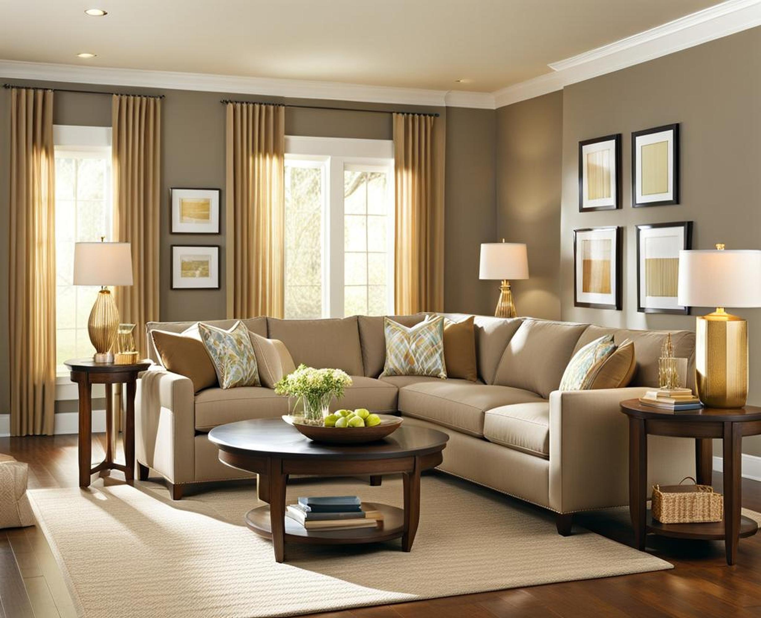
Dorian Gray by Benjamin Moore
Last on our list of the best living room paint colors for 2022 is Benjamin Moore’s popular neutral, Dorian Gray. This adaptable, gorgeous greige works beautifully as a soothing backdrop in any style of living space.
Dorian Gray is a warm taupe-gray that effortlessly straddles the line between brown and beige. It provides a versatile, welcoming neutral backdrop that allows bolder furnishings and decor to take center stage.
Use Dorian Gray to create a collected yet curated living room with an inviting, lived-in feel. Pair it with a mix of antique and modern furnishings to highlight its versatility.
Perfect Pairings
Dorian Gray complements both sleek and ornate furnishings, making it widely adaptable. Try combining it with elegant carved wood pieces, cozy linen sofas, and artisan-crafted decorations.
Choosing and Applying Paint
Once you’ve selected the perfect color for your living room, there are a few tips that can ensure painting success:
- Order small sample pots or paint strips to view colors on walls before committing.
- For easier application and subtle texture, opt for matte or eggshell sheen.
- Use painter’s tape and drop cloths to keep trim and floors protected.
- Apply a primer coat first for smoother, truer color coverage.
- Darker shades may require an extra coat or two for best results.
- Maintain even lighting in the room when viewing paint colors.
Choosing a new paint color for your living room is a fun way to give the space a fresh, stylish update this year. Whether you opt for a dramatic bold hue or a versatile new neutral, keep the tips above in mind as you explore the possibilities.
It may be hard to decide on just one paint option. But armed with a bit of inspiration and the factors that inform your personal needs and style, we’re confident you’ll find the perfect living room paint color for 2022. Whichever direction you decide to go – bold, neutral, warm, or cool – embrace the chance to infuse your space with a mood and style that speaks to you.
