Green, a color deeply rooted in nature, offers endless possibilities for creative combinations. Discovering the perfect color that goes with green can transform spaces and designs, infusing them with harmony and vitality. From earthy tones to soft pastels, the versatility of green allows for striking pairings that suit various aesthetics and moods. This exploration delves into the art of combining green with complementary hues, unveiling unique color schemes that breathe life into interiors, fashion, and visual arts. Let’s uncover the secrets of crafting captivating palettes with green as the star.
Understanding the Versatility of Green in Color Theory
Green stands as a pillar in color theory, occupying a unique position as both a primary color in light and a secondary color in pigments. This duality grants green an exceptional versatility in design and nature. The psychological effects of green are profound, often evoking feelings of growth, harmony, and balance. In design contexts, green can create environments that feel fresh, natural, and rejuvenating.
Different shades of green carry distinct characteristics. Lime green bursts with energy and vibrancy, while forest green conveys depth and richness. Sage green offers a softer, more muted approach, perfect for creating calm and serene atmospheres. The spectrum of green hues allows designers and artists to fine-tune their color choices to achieve specific emotional and visual impacts.
The importance of choosing complementary colors for green cannot be overstated. Complementary colors sit opposite each other on the color wheel, creating a dynamic visual tension that can be both striking and harmonious when used skillfully. For green, its direct complement is red, but this pairing can be intense. Often, designers opt for split-complementary schemes, using colors adjacent to red on the wheel, like coral or magenta, to create more nuanced and sophisticated palettes.
Understanding green’s place in color theory opens up a world of creative possibilities. By leveraging green’s natural associations and its relationships with other colors, designers can craft spaces and visuals that resonate deeply with viewers, whether the goal is to energize, soothe, or inspire.
Earthy Tones: The Perfect Companions for Natural Green
Earthy tones and natural green form a partnership that echoes the harmonious relationships found in nature. This pairing taps into our innate connection to the natural world, creating spaces and designs that feel grounded and organic. The combination of green with earthy hues like browns, tans, and warm grays can evoke the feeling of a lush forest floor or a serene woodland glade.
Natural brown, in particular, complements various shades of green with remarkable versatility. Light, sandy browns paired with sage green can create a beachy, relaxed atmosphere, while deep, rich browns combined with emerald or forest green evoke luxury and sophistication. This pairing works exceptionally well in interior design, where wooden elements naturally introduce brown tones that can be beautifully offset by green accents in furniture, textiles, or wall colors.
Incorporating terra cotta and sage green offers a balanced palette that feels both warm and cool simultaneously. Terra cotta’s rich, reddish-brown hue provides a warm contrast to sage green’s cool, muted tones. This combination can transport spaces to Mediterranean landscapes or rustic countryside settings, depending on how it’s applied. In fashion, this pairing can create earthy, bohemian looks that feel both trendy and timeless.
Creating depth with olive green and warm ochre combinations adds another layer to the earthy palette. Olive green, with its slightly muted, yellowish undertones, pairs beautifully with the golden hues of ochre. This combination can add richness and depth to designs, evoking images of sun-dappled forests or autumnal landscapes. In interior design, this pairing can create cozy, inviting spaces that feel both sophisticated and natural.
The key to successfully using earthy tones with green lies in balancing the intensity and warmth of the colors. Lighter, more muted greens tend to pair well with softer earth tones, creating serene and calming environments. In contrast, deeper, more vibrant greens can handle richer, more saturated earth tones, resulting in dramatic and impactful designs.
Neutral White and Green: A Timeless Pairing
The combination of neutral white and green creates a timeless pairing that exudes freshness and clarity. This classic color scheme harnesses the crisp contrast between white’s purity and green’s natural vibrancy, resulting in spaces and designs that feel both invigorating and serene. The stark contrast of white against green can create a visual impact that’s both bold and refreshing, reminiscent of dew-covered leaves or the first sprouts of spring against a snowy backdrop.
Using neutral white to highlight green’s vibrancy is a technique employed by designers to make green elements pop within a space or composition. White acts as a canvas, allowing the various shades and textures of green to stand out and become focal points. In interior design, white walls can provide the perfect backdrop for lush green plants, creating an indoor oasis that feels both spacious and alive. In graphic design, white space around green elements can draw the eye and emphasize the natural beauty and symbolism of green.
Balancing different green shades with white accents requires a thoughtful approach to create harmony and avoid overwhelming the senses. Lighter greens, such as mint or sage, paired with white can create a soft, airy feel perfect for bedrooms or spa-like bathrooms. Deeper greens, like emerald or forest green, when used with white, can add drama and sophistication to living rooms or dining areas. The key is to use white strategically to break up large areas of green, providing visual relief and defining spaces within a room.
Tips for creating a fresh, clean aesthetic with green and white include:
- Use white as the primary color for walls and large furniture pieces, introducing green through plants, artwork, and accessories.
- Experiment with different textures in both white and green elements to add depth and interest to the space.
- Consider using a variety of green shades within the same space, unified by white accents, to create a dynamic yet cohesive look.
- In kitchens, pair white cabinetry with a green backsplash or vice versa for a clean, energizing effect.
The neutral white and green combination offers versatility across various design contexts. In fashion, it can create looks that range from sporty and casual to elegant and sophisticated. In branding and logo design, this pairing can convey messages of growth, freshness, and eco-friendliness while maintaining a clean, professional appearance. By mastering the balance between these two colors, designers can create environments and visuals that feel simultaneously timeless and contemporary, natural and refined.
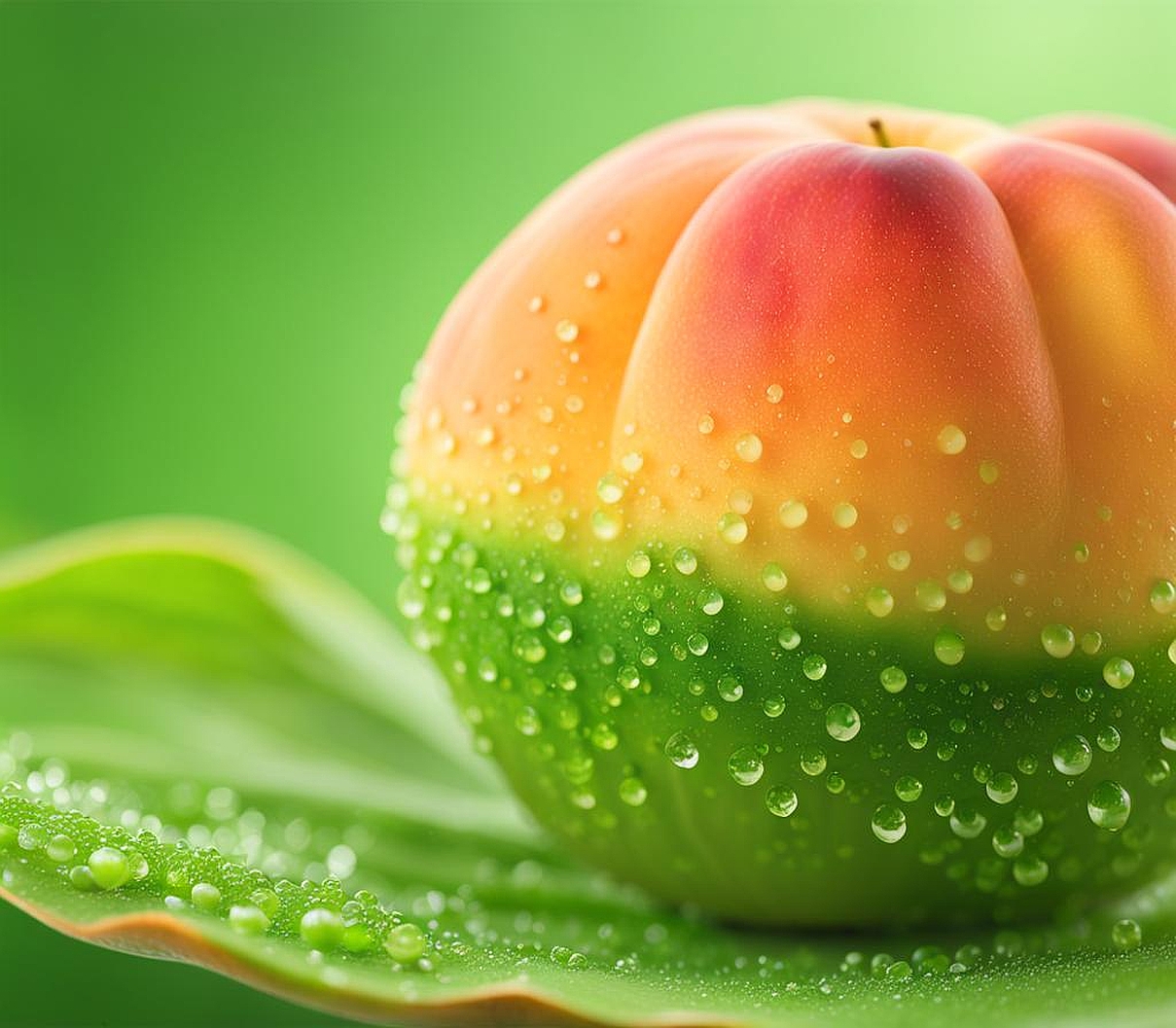
Soft Peach and Green: An Unexpected Harmony
The combination of soft peach and green presents an unexpected harmony that delights the senses and challenges traditional color pairings. This unique blend merges the warmth of peach with the coolness of green, creating a balanced and visually intriguing palette. The complementary nature of peach and green on the color wheel contributes to their dynamic relationship, offering designers and artists a fresh perspective on color harmony.
Soft peach, with its gentle warmth and subtle femininity, enhances the natural qualities of green in surprising ways. When paired with various shades of green, peach can bring out undertones and nuances that might otherwise go unnoticed. For instance, a soft peach can highlight the yellow undertones in a lime green, creating a lively and energetic combination. Alternatively, when paired with deeper forest greens, peach can soften the overall effect, adding a touch of warmth and approachability to what might otherwise be a more severe color scheme.
Balancing warm and cool tones in a green and peach palette requires a thoughtful approach. The key lies in finding the right intensity and shade of each color to create harmony rather than competition. A muted sage green paired with a soft, blush peach can create a soothing, spa-like atmosphere perfect for bedrooms or bathrooms. For a more vibrant look, a brighter emerald green can be balanced with a coral-tinged peach, ideal for creating accent walls or statement pieces in living spaces.
Design ideas for incorporating this unique color combination abound:
- In interior design, use peach as an accent color against predominantly green walls to create a fresh, spring-like atmosphere.
- For fashion, pair a soft peach blouse with olive green trousers for a sophisticated yet approachable look.
- In graphic design, use green as the primary color with peach accents to draw attention to key elements without overwhelming the viewer.
- Create a unique wedding color scheme by combining various shades of green with soft peach flowers and decor.
The unexpected pairing of soft peach and green opens up new possibilities in color theory and application. This combination challenges conventional wisdom about color matching, encouraging designers and artists to explore beyond traditional palettes. By embracing this harmonious yet surprising duo, creators can infuse their work with a fresh, contemporary feel that stands out in a sea of more predictable color schemes. The soft peach and green combination offers a perfect balance between warmth and coolness, making it versatile enough for various applications while maintaining its unique and eye-catching appeal.
Muted Blue and Green: A Serene Color Scheme
The pairing of muted blue and green creates a serene color scheme that evokes the tranquility of nature’s most calming elements. This combination recalls images of misty forests, serene lakes, and cloudy skies, bringing a sense of peace and harmony to any design or space. The calming effect of blue and green together stems from their proximity on the color wheel and their shared associations with nature and serenity.
Analyzing the calming effect of this pairing reveals its psychological impact. Blue is often associated with depth, stability, and trust, while green represents growth, harmony, and freshness. When combined, especially in their muted forms, these colors create an environment that feels balanced and soothing to the eye. This makes the muted blue and green combination particularly effective in spaces designed for relaxation or concentration, such as bedrooms, study areas, or meditation rooms.
Choosing the right shade of muted blue to pair with green requires consideration of the overall mood and function of the space or design. A soft, grayish blue can complement sage or olive green beautifully, creating a sophisticated and understated palette. For a slightly more vibrant yet still serene look, a muted teal blue paired with a forest green can evoke the depths of an evergreen forest. The key is to select shades that have similar levels of saturation and intensity to maintain harmony.
Creating depth and interest with varying intensities of blue and green can transform a simple color scheme into a rich, layered design. This can be achieved by:
- Using different textures in fabrics and materials to add visual interest within the same color family.
- Incorporating patterns that blend both colors, such as abstract prints or nature-inspired designs.
- Varying the lightness and darkness of the chosen blues and greens to create a sense of depth and dimension.
- Adding metallic accents in gold or silver to introduce a touch of elegance and break up the muted tones.
Applications of the muted blue and green color scheme in interior design are numerous. This palette works exceptionally well in coastal-inspired interiors, creating a sense of being near the ocean without resorting to cliche nautical themes. In living rooms, a muted blue sofa against a soft green wall can create a cozy yet refreshing atmosphere. For kitchens, blue cabinetry paired with green tile or wallpaper can offer a unique and calming twist on traditional design.
In fashion, the muted blue and green combination offers versatile options for both casual and formal wear. A muted blue blazer paired with olive green trousers can create a sophisticated yet approachable look for the office. For more casual settings, a sage green t-shirt under a muted blue denim jacket offers a fresh take on everyday wear.
The muted blue and green color scheme’s versatility extends beyond interior design and fashion. In graphic design and branding, this combination can convey messages of trust, growth, and environmental consciousness, making it particularly effective for businesses in the health, education, or eco-friendly sectors. By carefully selecting and balancing these muted tones, designers can create visually appealing and psychologically impactful designs that resonate deeply with viewers.
Exploring advanced color combinations with green as the focal point opens up a world of creative possibilities for designers and artists. These sophisticated color schemes go beyond simple pairings to create rich, multifaceted palettes that can dramatically enhance the visual impact of any project. By understanding and applying these advanced techniques, creators can elevate their work to new levels of complexity and appeal.
Triadic color schemes featuring green offer a vibrant and balanced approach to color harmony. In this scheme, green is combined with two other colors equidistant from it on the color wheel, typically violet and orange. This creates a dynamic and energetic palette that, when used skillfully, can produce striking visual effects. For example, a deep forest green paired with royal purple and burnt orange can create a rich, autumnal feel perfect for branding or interior design projects aiming for a bold, sophisticated look.
Monochromatic green palettes provide a sophisticated alternative to more complex color schemes. By using various shades, tints, and tones of green, designers can create depth and interest within a unified color theme. This approach works particularly well in minimalist designs or when aiming to create a sense of calm and cohesion. In interior design, a monochromatic green scheme might include sage walls, emerald accent pieces, and olive textiles, creating a lush, immersive environment reminiscent of a tranquil forest.
Unexpected color pairings that make green pop can lead to truly innovative designs. Some intriguing combinations include:
- Green and lavender: This unexpected pairing creates a fresh, spring-like feel that’s both soothing and invigorating.
- Green and coral: Offering a tropical vibe, this combination balances the coolness of green with the warmth of coral.
- Green and mustard yellow: A bold pairing that evokes images of sunflowers in a field, perfect for creating energetic, nature-inspired designs.
- Green and burgundy: This rich combination offers a sophisticated palette reminiscent of lush gardens and fine wines.
Tips for balancing multiple colors in a green-centric design are crucial for creating cohesive and visually appealing results. Consider the following strategies:
- Use the 60-30-10 rule: Make green 60% of the color scheme, a secondary color 30%, and an accent color 10% to maintain balance.
- Incorporate neutrals: White, black, or gray can help ground more vibrant color combinations and prevent overwhelming the senses.
- Consider lighting: Natural and artificial light can significantly affect how green and its companion colors appear, so test color combinations under various lighting conditions.
- Use texture to add depth: Varying textures within the same color family can add interest and dimension to monochromatic or limited color schemes.
- Balance warm and cool tones: When using multiple colors, ensure a balance between warm and cool hues to create a harmonious overall effect.
Advanced color combinations with green as the focal point offer endless opportunities for creative expression. Whether through triadic schemes, monochromatic palettes, or unexpected pairings, green’s versatility allows it to shine in various contexts. By mastering these advanced techniques, designers can create sophisticated, eye-catching designs that leverage the full potential of green’s natural beauty and psychological impact. The key lies in experimentation, understanding color theory principles, and having the confidence to push boundaries in pursuit of truly unique and compelling color combinations.
