Giving your kitchen a stylish makeover often starts with upgrading your cabinets and floors. By combining bold, attention-grabbing cabinet colors with complementary floor tones, you can transform the entire look and feel of this essential space. From crisp white cabinets popping against rich wood floors to muted blue cabinetry matching breezy tile, the possibilities are stunning. We’ll walk through the fundamentals for choosing a cohesive yet daring kitchen color scheme before unveiling heavenly cabinet and floor combinations destined for design greatness.
But first, let’s explore why paying attention to your kitchen’s color palette is so pivotal in taking its style to the next level.
The Importance of Cohesive Yet Daring Kitchen Design
As the heart of every home, a kitchen should reflect the homeowners’ personal aesthetic through creative finishes and materials. However, many fall short of design greatness by playing it safe with blah cabinet and floor pairings. Beige and brown may blend seamlessly, but a bold, complementary color scheme has unrivaled visual impact.
The key is choosing colors in the same family that also have enough contrast to capture attention. For example, deep blue lower cabinets pop against pale blue uppers. White perimeter counters play up the drama of a navy blue focal island. Ultimately, thoughtful color choices make kitchen components work in harmony for a whole greater than the sum of mismatched parts.
An Overview of Cabinet & Floor Color Pairing Fundamentals
Like expert interior designers, we must brush up on color theory basics when planning stunning cabinet and floor combinations. The goal is to use varying shades in the same color family that share undertones. For kitchens, three colors typically look most cohesive–one dominant shade and two accent tones.
Context matters too. Factors like lighting, room size, countertop materials and more impact how colors appear and interact. By keeping key principles in mind, you’ll craft a seamless kitchen color scheme with serious wow factor.
Best Practices for Selecting a Kitchen Color Palette
With limitless paint options lining store shelves, choosing that perfect trifecta of hues can prove downright daunting. Before making any final decisions, keep these guidelines in mind.
Deciding on 3 Impactful yet Complementary Colors
Recall that less is often more regarding color palettes. Select one commanding cabinets shade to serve as the backbone of your design–perhaps a dramatic navy blue or vibrant lime green. Then bring in two flexible accent colors like crisp white and weathered gray wood.
These three related colors form a flexible foundation you can build upon with metal hardware, patterned tile or textiles. Just ensure accent shades have enough contrast from your lead color to make a wildly stylish statement.
Factoring in Cabinets, Counters, Backsplashes & More
Your cabinet and floor color selection impacts how additional kitchen components look too. For example, walls painted the same tone as perimeter cabinetry subtly blend these elements. Or if your peninsula island runs a deeper blue than sage lower cabinets, their contrast looks especially captivating.
Likewise, a coordinating quartz countertop and cream ceramic backsplash align beautifully with two-toned cabinetry in complementary shades. Thinking through how all finishes interact allows refined, holistic palettes to shine.
How Lighting Impacts Perceived Color
The interplay of natural and artificial lighting changes how kitchen surfaces appear–sometimes dramatically. Blue paint hitting sunlight often reads brighter and crisp white can skew dull or yellowish under dim bulbs.
When possible, evaluate your space at varied times of day. If that’s not feasible, rely on ample lighting built into cabinet design for accurate color. Also pick sheens to maximize light reflection.
Establishing an Overall Style Goal
Your kitchen should ultimately reflect a defined aesthetic vision through every design decision. Are you channeling modern, industrial edge with concrete-look tile or aiming for breezy Hamptons appeal with painted cottage cabinets?
Work backwards from your style goal to choose color combinations expressing that genre. The most alluring kitchens have an unmistakable point of view visible through their palettes.
The Most Captivating Cabinet & Floor Combinations
Now for the fun part–revealing gorgeous cabinet and floor pairings destined for Pinterest stardom! Let’s dive into brilliant blended color palettes sure to inspire.
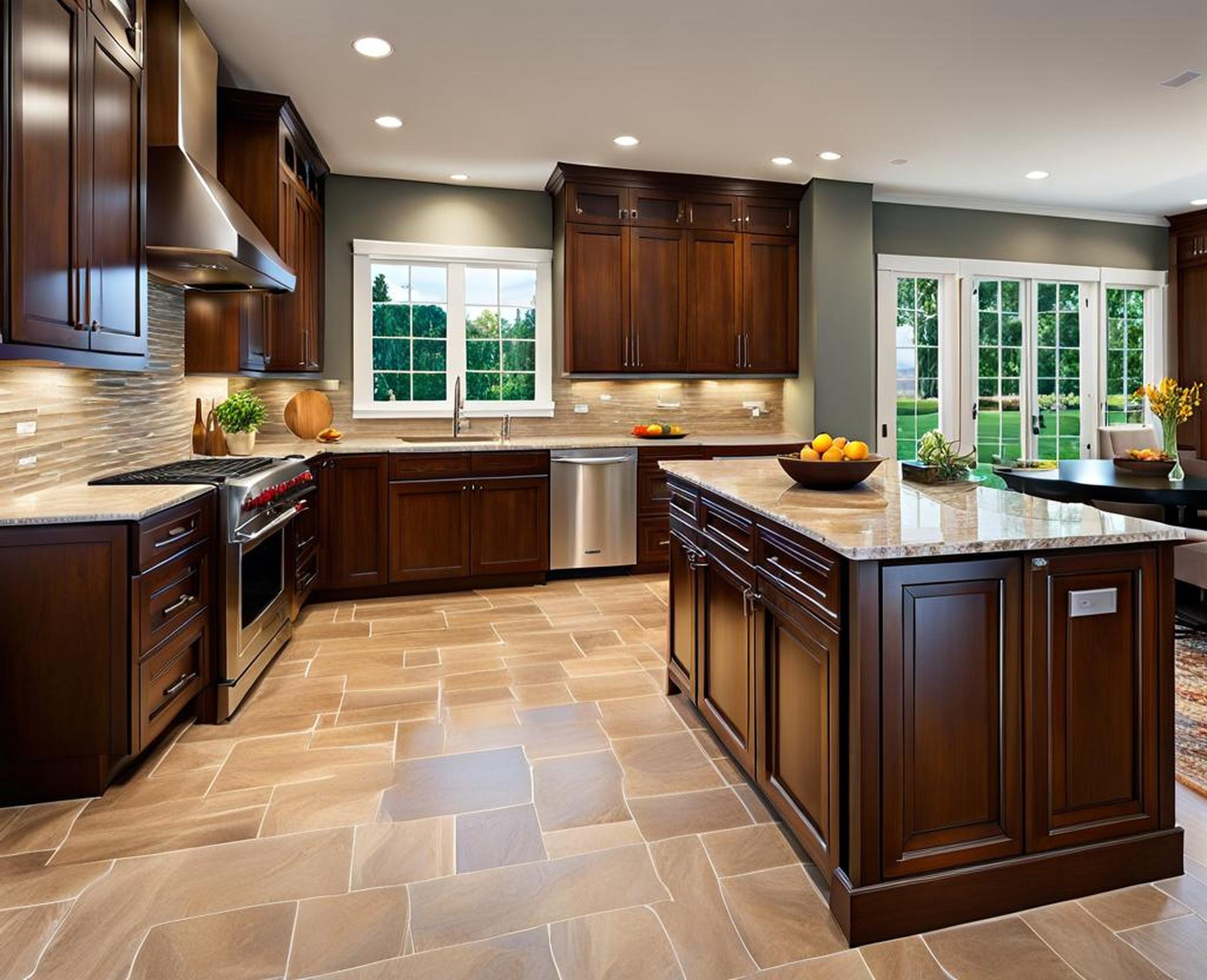
Crisp White Cabinets with Rich Wood Flooring
This beloved combo mixes timeless white painted cabinetry with the welcoming warmth of wood floors for crisp, balanced style. The two neutrals strike an ideal contrast–one light and airy, the other grounded with organic texture.
Classic, Inviting Appeal
White kitchen cabinetry proves eternally appealing for its clean, spacious look. Meanwhile, wood flooring infuses natural depth and dimension for a livable vibe. Blending the two keeps your design fresh and flexible for decades to come while avoiding stark sterility.
Chic Contrast for Visual Interest
Varying texture and light reflection provide essential visual contrast. Flat white paint next to wood’s variated grain helps differentiate components to each shine. Adding an island in the wood flooring tone builds on their fluid interplay through clever repetition.
The Best Wood Tones to Pair with White Cabinets
White kitchen cabinets allow for rich creative freedom in wood floor choices. From weathered gray oak planks for contemporary edge to dramatic walnut patterns infusing warmth, options abound. Just pick organic flooring free of overpowering yellow and orange undertones to keep the palette crisp.
Key Factors in Selecting Kitchen Surfaces
Beyond cabinets and floors, additional elements impact your kitchen’s color palette success. Make strategic choices regarding countertops, backsplashes, islands and more.
Countertop Materials: Granite, Quartz & More
Kitchen remodels often call for upgraded countertops too. Quartz and granite remain beloved options, each with perks. Engineered quartz mixes natural stone and resin for fashion-forward hues without maintenance woes. Granite delivers unique patterning, but requires vigilant sealing.
Remember to pick neutral countertop colors that tie in with your cabinets and floors. Aim for low contrast to keep surfaces cohesive. So for example, avoid pairing vibrant teal cabinets with fiery red granite.
Backsplash Trends: Tile, Glass & Creative Accents
While once merely functional, today’s kitchen backsplashes make serious design statements. From artful handmade tile to bold glass sheets, stunning backsplash options abound. Even painted drywall scribed with dimensional lines and shapes refreshes. Just tailor choices to your dominant color scheme.
For instance, metallic subway tile aligns beautifully with industrial cabinet and concrete flooring combos. Or vibrant patterned Moroccan tiles complement rich jewel-toned cabinetry.
Island Design for Maximum Visual Impact
Kitchen islands remain wildly popular for their versatility and style. To make that centerpiece area really stand out, select a paint color that pops against perimeter cabinetry and floors.
Varying the island’s height and combining matte and glossy finishes also spotlights it. Just ensure your showstopping island shade plays up rather than fights against the core color scheme for stunning cohesion.
Pulling It All Together: A Cohesive Game Plan
Hopefully we’ve illuminated tactics for creating stunning, harmonious kitchen palettes even with bold color choices. By planning thoroughly, carefully evaluating each element’s interplay and checking lighting conditions, your daring design will impress.
Trying Out Color Schemes Virtually First
Advanced 3D design software now allows accurately visualizing color combinations in your exact kitchen. Upload images and dimensions to view enticing options applied virtually first. This takes guesswork and second-guessing out of the equation.
Ensuring Consistent Tones & Undertones
Light reflection means the same Benjamin Moore gray reads differently on vertical cabinets versus horizontal island surfaces. When choosing finishes, bring home physical samples sized 4″x4″ for most accurate color consistency.
Pay special attention to undertones that can skew cool, warm or neutral across materials. Keep these consistent for soothing cohesion. Else seemingly similar grays and tans may clash upon installation.
Tying the Space Together with Unifying Finishes
Once your core cabinet, island, countertop and floor colors establish visual flow, reinforce connections through metal finishes and fixtures. Modern brushed gold hardware, handles and lighting feels cohesive yet special. Basically, all the subtle touches should tie back to the color scheme for polished harmony.
By focusing first on daring cabinet and floor combinations handled skillfully, you start any kitchen redesign on the right foot. Vibrant color palettes feel captivating when underlying theory helps guide choices. Now get ready to bring new energy and style into your kitchen’s heart and soul!
