Renovating or building a new kitchen is an exciting endeavor, allowing homeowners to put their personal style on full display. However, with so many options for finishes, materials, and colors, the process can also feel totally overwhelming. Coordinating cabinetry, floors, countertops, backsplashes, and appliances into a cohesive palette is one of the biggest challenges.
Strategically pairing floor and cabinet colors lays a strong foundation for the rest of the kitchen’s design. It makes the space look pulled-together, expensive, and purposefully curated. Miss the mark with uncoordinated shades, and the kitchen will feel disjointed instead of the showstopping heart of the home it deserves to be.
Complementing Design Elements and Style
When embarking on a kitchen refresh, the first consideration should be the intended design style and aesthetic. The color scheme and materials for both the flooring and cabinets need to align with and enhance that overarching vision.
Match Floors and Cabinets to Style
For a modern, contemporary kitchen, sleek cabinets in a neutral white or gray paired with light wood or concrete-inspired vinyl flooring communicate that pared-down, minimalist sensibility. In a traditional kitchen, on the other hand, classic raised-panel oak cabinets with ceramic tile floors in warm earth tones fit right in.
| Modern | White lacquer cabinets, blonde wood floors |
| Farmhouse | Navy blue lower cabinets, butcher block countertop, brick vinyl floors |
| Transitional | Two-toned cabinets, light oak floors |
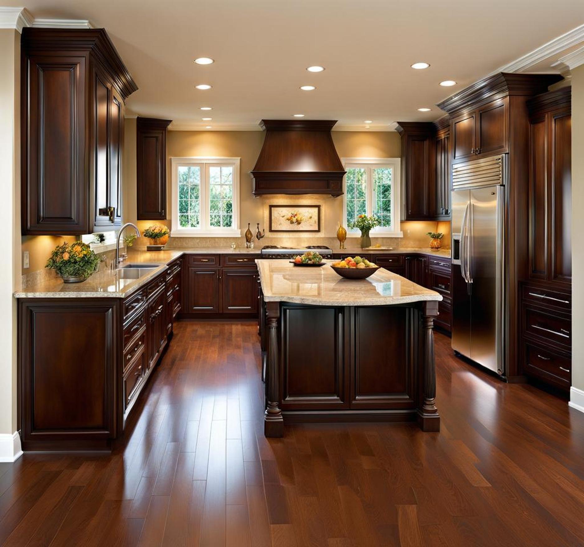
| Traditional | Cherry wood cabinets, travertine tile flooring |
Kitchens flaunting a particular aesthetic should stick to colors and materials that align with the goal style. Orchestrating all the finishes into the desired look demonstrates an intentional, polished design.
Coordinate Cabinets and Floors with Other Elements
Beyond just pairing cabinet and floor hues, also make sure they complement additional kitchen elements like countertops, backsplashes, and appliances. A reddish granite countertop would match wonderfully with dark cherry cabinets and a brick vinyl floor. Or crisp white uppers and lowers with neutral subway tile backsplash present a clean, coherent look paired with light oak plank floors. Think about the kitchen holistically during the design process.
Create Visual Harmony with 60-30-10 Rule
An easy trick professional designers use to create harmonious, perfectly curated palettes is the 60-30-10 rule. Devote 60% of the kitchen’s visual space to a dominant color, 30% to a secondary color, and 10% to a pop accent shade. For example, white cabinets can cover most of the visual area, while wood floors offer a warm secondary color. A brightly colored oven or piece of statement art incorporates the eye-catching accent. The percentages create a soothing, complete look.
Wood Tones
Wood cabinetry and flooring infuse kitchens with natural, organic beauty. Timeless and versatile, wood sets the stage for decor and appliances to shine.
Warm, Natural Material Pairs Well with Multiple Color Schemes
Wood brings warmth and texture, suiting multiple aesthetics from modern to traditional. Walnut floors with white uppers and lowers create contrast. Or stick with all wood elements for a cozy rustic ambiance. Beige stone backsplash and bronze fixtures pop against dark cabinetry.
Contrast Light and Dark Wood Tones
Too matchy-matchy wood finishes render kitchens flat and one-dimensional. Instead, play lighter oak hardwoods off deeper mahogany stains. Or pair painted lower cabinets in a light tone with raw wood uppers for dimension. Contrast draws the eye around the kitchen.
Types of Wood Flooring and Cabinetry
| Oak | Cherry |
| Hickory | Alder |
| Walnut | Pine |
| Maple | Birch |
Whether building cabinets custom or opting for off-the-shelf options, numerous wood species and stains exist. Coordinate tones and grains to establish depth throughout the kitchen.
Tile and Stone Surfaces
Cool, Sleek Complement to Painted Cabinets
Ceramic, porcelain, or stone tile visually cools warmer cabinet colors like cream, gray, and wood. Mixing materials adds appealing texture. Glossy subway tiles contrast beautifully with flat painted cabinet fronts in delightful juxtaposition.
Consider Texture and Pattern for Visual Interest
Vary tile sizes, alternating 12″ and 3″ rectangles. Or choose one oversized tile for modern simplicity. Add intrigue with Moroccan fish scale tiles or intricate mosaics. Geometric, Middle Eastern-inspired or Spanish patterns enliven traditional schemes. Notably, opt for solid cabinet colors to prevent compete with ornate floor tiles.
Grout Color Impacts Overall Look
Grout binds tiles, but color choice affects the floor’s appearance. Matching grout to tiles minimizes the grid appearance for a seamless aesthetic. Lighter grout enlarges spaces visually, while dark shades ground light floors. Contrasting grout emphasizes tile colors and designs.
Navigating Color Theory
Understanding how colors interact guides foolproof kitchen schemes. Certain pairings sing, while others crash discordantly.
Background on Color Psychology and Perception
Humans intuitively react to colorpalettes, called color psychology. Societal associations, personal memories and nature’s hues inform perceptions from warm to cool, heavy to ethereal. Red radiates heat, energy and urgency. Blue elicits calm, tranquility and refreshment–remember nature’s water and sky.
Warm vs. Cool Undertones
All colors contain warm or cool undertones. Warm shades lean yellow with familiar comfort. Red brick fireplaces and golden sunsets come to mind here. Cool shades have blue undertones reminiscent of ice and steel. Green straddles the middle as a neutral. While personal taste dictates, warm neutrals in greige, almond and sandstone often pair pleasingly with cabinetry and flooring.
Using Neutrals and Natural Colors as Base
Build kitchen color palettes on quiet, uncomplicated neutrals like cream, gray and taupe. Dusty blue and pale green read as grounded yet interesting neutrals too. Cool grays balance warm wood cabinets, while greige grounds crisp white painted finishes. Let bolder mineral green counters or cobalt blue barstools take center stage against neutral backdrops.
Pops of Color as Accents
Once neutral cabinetry and floors establish the foundation, inject personality with vivid mosaic backsplashes, brightly colored appliances or vibrant rugs. Limit high-energy hues to decorative accents so they don’t overpower the space’s tranquility, equivalent to 10% of the 60-30-10 design formula.
Monochromatic Schemes
A monochromatic scheme utilizes a single base color. The effect calms kitchens, elongates narrow galley layouts and defines conversation areas. With cabinetry, flooring and often countertops in the same color family, these spaces cultivate harmony.
Vary the color’s saturation and brightness for subtle contrast. Deeper tones on lower cabinets balance crisp white uppers and draw attention downward, expanding ceilings visually. For uniformly expansive vistas, stick to a single neutralized middle shade throughout wall cabinets, base cabinets and flooring.
Inject vitality by thoughtfully interrupting large swaths of color with textural materials like brick veneer or shelving in a different substance.
Complementary Colors
Complementary colors sit opposite one another on the traditional color wheel, ensuring high contrast. Classic red and green pairings tend to skew Christmas-y, though softer sage green fits with cherry or walnut brown cabinetry handsomely. More frequently, blue and orange opposites create excitements, yet still soothe in a spacious kitchen with ample natural light. Allow plentiful negative space to ease the intensity.
| Red | Green |
| Orange | Blue |
| Yellow | Purple |
The bold dynamic lights each element beautifully.
Analogous Colors
Analogous colors reside next to each other on the color wheel, ensuring compatible vibes. Think shades of sage, olive and lime green or cherry, red and burgundy grouping beautifully. Analogous schemes with flooring, cabinetry and metals in three adjacent colors elicit ultra-soothing spaces.
Consider Kitchen Size and Layout
A kitchen’s dimensions and flow impact color and material options. Bright, airy palettes keep tight quarters feeling spacious and open.
Dark vs. Light Colors in Small and Large Kitchens
Small kitchens benefit from reflective lighter wall colors, countertops and flooring. White, light gray or neutral oak bounce natural light, resisting boxed-in sensations. Light cabinets also recede optically, diminishing their presence. Save chocolate cabinets and inky floors for generous great rooms.
Meanwhile, sizable kitchens withstand deeper colors without closing in the space. Here, install lush wine-hued cabinets or ebony framed uppers and floors without fear. Balance darkness with ample task and ambient lighting. In larger kitchens, neutrals might feel hollow or cold, and bolder color fills the void.
Minimizing Busy Patterns in Compact Kitchens
In small kitchens, limit intense graphics, multi-colored stone surfaces or ornate metal inlays. These features distract, assaulting when in close proximity for long durations. Solid surface countertops, simple subway tile and flat panel cabinets soothe tiny rooms.
Allowing Natural Light to Brighten Spaces
Generous windows bathe kitchens with natural illumination, balancing heavier floor and cabinet elements while minimizing lighting requirements. Enjoy moody colors and materials without sacrificing function.
Functionality and Lifestyle Factors
Along with visual components, consider how flooring and cabinetry selections support everyday life.
Opt for Durable, Stain-Resistant Materials
For busy households the kitchen takes heavy wear and tear. Opt for long-wearing solid hardwood over delicate finishes like wire-brushed oak. Durable surfaces like quartz, porcelain, laminate and quality vinyl resist stains, abrasions and temperature damage from hot pans landing on counters more effectively than natural stone and butcher block.
Accommodate High Traffic Areas
Zone floors according to traffic patterns. For example, install plush wool rugs around a working island for ergonomic cushioning with beautiful solid oak herringbone floors handling surrounding wear.
Easy Maintenance for Busy Households
Maintenance directly correlates to durability. Higher quality materials withstandMES and require less frequent deep cleaning or restoration. For mess-prone families, choose materials known for no-fuss cleaning like ceramic tile, single-pane cabinet doors and wipeable faux leather finishes.
Kid and Pet Friendly Flooring
Lively homes with kids and pets involve inevitable spills, tracked-in dirt and accidents requiring heavy-duty floors. Waterproof luxury vinyl plank offers style and scratch resistance with easy cleanup.
Coordinating kitchen floor and cabinet colors ranks among the most powerful yet challenging design endeavors. When thoughtfully orchestrated into a cohesive, intentional scheme aligned with the desired aesthetic, the payoff proves phenomenally rewarding.
Hire a professional designer or color consultant to finesse a personalized palette. Bring photos of the existing kitchen along with inspiration images from magazines or Pinterest to crystalize the look you long to achieve. Experts also help select finishes that perform under family living, keeping kitchens both beautiful and highly functional for years to come.
